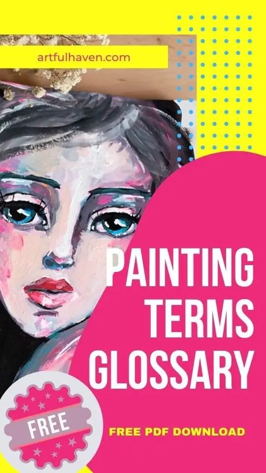
100+ Painting Terms You’ll Ever Need – for Art Journal Beginners
If you’ve been “arting” for a while, or just starting out, you definitely came across many tutorials or texts that were using painting terms you didn’t quite understand.
Well, for those wondering what some of the terms are, you’ll find plenty of information in this article.
I tried to summarize painting terms used mostly in art journaling. Although there are some drawing (and other) terms as well, this is because they’re closely connected to painting.
The terms are in alphabetical order, so you can easily find your way around.
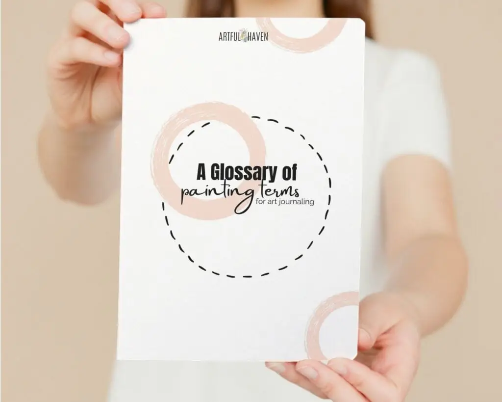
Also, if you’d like a printed version of this glossary, just fill out the form below and you’ll get a pdf with all the terms. You can then put it in your art journal, above your desk, or keep it on your computer.
Disclaimer: Some links in this post may be affiliate links. This means that if you purchase something through that link, I get a small commission, at no extra cost to you.
THE LIST OF PAINTING TERMS
A
ABSTRACT
Abstract art doesn’t require a realistic depiction of reality but rather uses shapes, colors, forms, and similar to achieve a certain effect.
ACCENT
An accentuated element is an element that differs from its surroundings in color, size, shape, etc. It pops from other elements and it is often the most important part of an artwork.
ACRYLICS
Acrylic paint is a fast-drying, water-based paint used with a brush and with/without water.
It’s the study of beauty and taste. You can say it’s a branch of philosophy dealing with beautiful things.
ANALOGOUS COLORS
These are the colors that sit next to each other on the color wheel. An example would be green, yellow-green, yellow.
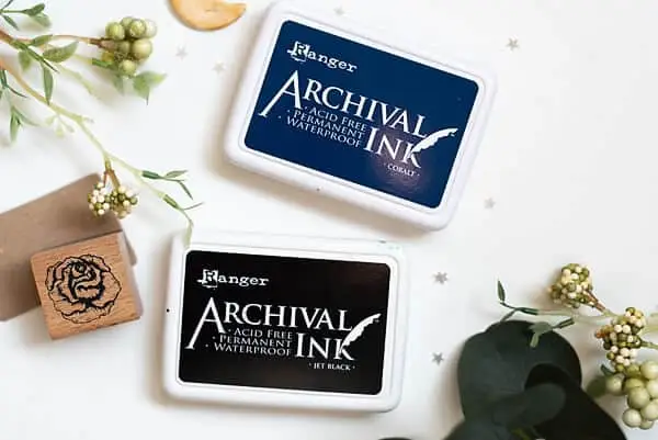
ARCHIVAL
Archival means that something can be used for the long term. For example, if you have an archival ink pad, it means the ink is durable after you’ve used it on paper, and it won’t affect other media or fade with time.
ARCHIVAL PAPERS
This is a durable and permanent kind of paper. It’s often used for important documents that need to be used for a long time. It’s also acid-free.
B
BACKGROUND
The background is used to create context, to give depth to your work. In art journaling, it’s also an easy foundation for starting your art journal pages. It’s the space that surrounds your other elements, drawing, etc.
BALANCE
Balance is one of the design principles where you want to align your elements (lines, shapes, color, forms, etc) so they look natural together and flowing. If your artwork is balanced, you feel comfortable looking at it.
BLENDING
When you use two or more colors and softly mix them to create a gradual transition or to lose harsh lines and soften the image.
BLENDING STUMP
A blending stump is a tool made of paper used to blend a pencil in a drawing.
BLOCKING IN
When you want to paint something, you can first use shapes to block in the places where you’ll paint. You can block in different colors, positions, or values.
BRUSH MARKS
Traces or marks created by brush bristles that are visible after you paint with a brush. They’re used to create texture and interest.
C
CALLIGRAPHY
It’s decorative handwriting that often takes a lot of hours to learn. Mostly done with a pen or a brush.
CARBON PENCIL
These are pencils that are softer than granite but have black charcoal richness.
CHARCOAL
Charcoal pencils are “messier” than graphite. So, for example, if you draw something with it and then close your art journal, it may smear and leave marks on the opposite page.
CHIAROSCURO
Explained by Artsy: The term chiaroscuro stems from the Italian words chiaro (“clear” or “bright”) and oscuro (“obscure” or “dark”), and refers to the arrangement of light and shade in a work of art.
CLOSED COMPOSITION
You create a closed composition when you arrange your elements within a frame.
COAT
A coat of color is a layer of color you paint.
COLLAGE
It’s an art form where you put an image together from pieces of paper or images, often to tell a story.
COLOR TEMPERATURE
It’s whether the color seems cool or warm. That’s why you have cool and warm colors. Combining warm and cool colors can create a great contrast effect. But also, using only warm or only cool colors gives your work a special, balanced feel. Warm colors seem to look closer while cool ones may appear further away.
COLOR VALUE
The color value is its light and dark variations. You can make lighter values by adding white and darker by adding black to your main color.
COLOR WHEEL
It’s an imaginary circle where all the colors are placed and it shows their relationships and combinations.
COMPLEMENTARY COLORS
Complementary colors sit opposite one another on the color wheel. Also, when mixed together, they create a grayscale color (black or white). However, used together without blending can create high contrast which is quite interesting in art.
COMPOSITION
Composition is a way in which elements of your artwork are arranged. There are some composition principles that can help you with this in order to make interesting effects.
CONTOUR DRAWING
When you do contour drawing, you are more concerned about the volume and shape of your drawing, rather than the details. It’s focused on the outlines of a drawing.
COOL COLORS
Cool colors are green, blue, and purple (and their variations).
CRAYON
A crayon is a stick or a pencil with colored wax used to draw or to write.
DRY BRUSH
It’s a technique in painting when you use a brush with no water and some paint. This can result in visible brush strokes that add texture and depth.
DYNAMIC
Dynamic compositions are full of movement. It’s when you use your elements, drawing, or paint to create movement (like flowing hair, lines that imitate movements, etc.)
E
EMPHASIS
It’s a design principle where you create an element of centered interest. You can achieve this by contrasting colors, or for example, with lines that point the viewer to the central element.
F
FIXATIVE
A fixative is a medium used to spray over drawings with pastel, charcoal, or graphite to prevent them from smudging.
FOCAL POINT
This is the most emphasized part of your artwork, to which all other elements point and make it stand out (marking it as important for the viewer to understand the message). The viewer’s eye is naturally drawn to it with the help of design, composition, and other elements.
FOREGROUND
This is the area of your artwork that is closest to the viewer. Behind it comes the middle ground and finally the background.
G
GESSO
Gesso is a medium used to prime canvases or paper before putting paint on them. In art journaling, it’s mostly used to stop the paper from absorbing liquid and thus preventing bleeding. There are white, black, and clear (transparent) gessoes.
GLAZE
Winsor & Newton say that “Glazing is a technique used to bring together light and dark tones, and to bring out luminosity in a painting”.
GOUACHE
It’s a paint that’s more opaque than watercolor. This means that, as opposed to watercolor, the gouache paint will cover the paper completely, whereas, in watercolor paintings, the paper is still visible due to the translucency of watercolors.
GRADATION
It’s a slow transition between colors, lines, texture, etc.
GROUND
A ground is a layer that is used to prepare the paper or the canvas for painting. You can create such ground with gesso, for example.
H
HARMONY
An artist achieves harmony when they combine elements together that are comfortable and enjoyable to the viewer. This means they think about color combinations, elements placing, etc. in order to make them all connected and agreeable.
HATCHING
It’s a technique in drawing when you want to create a shading effect by drawing parallel lines very close to each other.
HIGHLIGHT
Highlights are used to define an object, together with shadows. They are seen as spots/areas where light would touch the object.
I
IMPASTO
It’s a thick application of paint done on purpose, to make it look textured and thick and the brush marks (or painting knife marks) are clearly visible. This technique was used by many artists, including Van Gogh.
INK
It’s used for drawing, writing, and painting. There are different kinds of inks:
- dye-based (created with water-soluble dyes),
- acrylic (created with pigments that make it behave like acrylic paint. You can mix them with acrylic paint, and they probably won’t fade with time. They’re also waterproof),
- alcohol (they are very popular in art journaling and card making.),
- archival (When I say archival, I mean inks that can’t fade and are waterproof. For art journaling, you can get archival ink pads that’ll be one of the most valuable art supplies).
L
LAYER
In painting, layering is when you gradually paint an area in order to achieve a certain result. For example, if you want to paint shadows of a face with watercolor, you’ll do it gradually and build up the shadow with multiple layers.
Also, in art journaling and mixed media, a layer is any time you add one thing something you’ve done previously. For example, you can layer papers, paint, stamp marks, images, etc.
M
MASKING FLUID
Masking fluid is used to create negative space or a shape you don’t want to paint. It repels paint and water and thus leaves a clean space. It’s important to put the masking fluid on a completely dry paper or paint.
MATTE
Matte finish is the opposite of glossy. Have you ever taken a magazine image under a lamp? Right, it’s so glossy that it reflects the light and you can’t see it properly. On the other hand, a matte finish has no gloss at all. You can also buy paint and media with gloss or a matte finish.
MECHANICAL PENCIL
It’s a pencil that has replaceable graphite called a “lead”.
MEDIUM
A medium is any material you use to make an artwork or it can mean the type of artwork itself.
MINIMALISM
Minimalism art revolves around things such as geometrical shapes, lines, and color. These artists use an objective approach as opposed to a subjective view, making the viewer see things/art as they are without a personal story or meaning.
MIXED MEDIA
Mixed media artists use different media to create an artwork. For example, if you use acrylic paint, paper, watercolor, crayons, glue, and lace, you create a complex and layered mixed media piece.
MODELING PASTE
It’s a thick paste that when applied to paper or canvas, creates texture and relief.
MONOCHROME
If you paint in monochrome, you either use black and white, or you paint in varying tones of only one color.
MOOD
The mood is the atmosphere or a feeling a piece of art conveys. You can use colors to express your mood. For example, well-balanced colors can show ease and peacefulness.
MOVEMENT
We can create movement in our artworks by drawing or painting in different techniques and using certain media. For example, you can add paint with brush strokes that suggest movement.
N
NEGATIVE SPACE
Negative space is the area that surrounds your main subject or element. It can be painted or not and it serves to help the main element pop and gain more importance.
O
OIL PAINT
These paints are oil-based – their pigments are held together by oil. Unlike acrylic paint, which is water-based. The two are similar, but still, there are many differences between these two paints.
ONE LINE DRAWING
It’s when you draw using only one, continuous line. You don’t break the line at all, but you can draw over the same areas more than once.
OPACITY
Opacity is the level at which paint is transparent. The paint lacking transparency is opaque. That’s why most acrylic paints are opaque and watercolors are translucent.
OPAQUE
It means something isn’t transparent. When the paint is opaque, you can cover any layer beneath it and the previous layers won’t show. This can come in handy when you buy acrylic paints.
If you want great coverage and no transparency, then get the opaque ones.
P
PAINT BRUSHES
Brushes used for painting, of course. There are many different shapes, sizes, and materials: round, flat, filbert, fan, etc.
PAINTERLY
Painterly art shows loose brush strokes rather than strong, defining lines. The painted image consists of brush strokes that seem uncontrolled, even smudged.
PALETTE
- A palette is a thin board that you can use to lay paint and mix it. They can be wooden, plastic, etc.
- Palette can also refer to a range of colors an artist uses for one piece.
PALETTE KNIFE
A palette knife is a tool used to mix paint on the palette. You can also paint with it.
PAINTING KNIFE
Similar to the palette knife, a painting knife is used to apply paint on canvas or paper. Using this tool, you can get a lot of texture.
PASTELS
These are drawing sticks that consist of powdered pigment and a binder. They can paint in very bright colors. There are different kinds of pastels: pan pastels, soft pastels, oil pastels, hard pastels, water-soluble ones, etc.
PIGMENT
This is a colored material/substance added to paints, inks, clothes, food, etc., to make them a certain color.
POLYCHROMATIC
It means something is multicolored. As simple as that.
POSITIVE SPACE
Positive space in the artwork includes all the primary points of interest, for example, a portrait, trees in a landscape, anything that’s the main element.
PRIMARY COLORS
The primary colors are red, blue, and yellow. They’re called primary because you can make all other colors from their combinations.
PRIMER
Also called a ground, a primer is a “preparing” or “ground” layer you put on before you start painting. For example, you can do this with gesso on a canvas or paper.
PROPORTION
Proportion refers to sizes. If you look at elements in your artwork, proportion refers to how big or small something is in comparison to other elements.
R
RADIAL
It’s a way you organize elements in your artwork. Radial composition refers to arranging elements in a shape of a circle, where the elements spread out from a central point in the circle.
REPETITION
When you draw or paint, repetition is repeating the same element more times. It can create interest and patterns as well.
ROLLER
This is a painting tool that uses a roller to apply paint. They can be textured, smooth, made of sponge or harder materials. Mostly used in art journaling and mixed media are so-called brayers.
RULE OF THIRDS
Basically, if you take your paper/ page and divide it into 9 equal parts by two vertical and two horizontal lines, you’ll get a grid. Imagine this as a grid for tic tac toe.
These lines meet at 4 different points. These points are the most appealing to the eyes, so by placing the objects here, you immediately invite the viewer’s eye to that object.
S
SCALE
Scale refers to the size of objects in your artwork when compared to one another.
SCRAPE
The scraping technique involves acrylic paint and a tool you use to scrape it over the paper. This tool can be as simple as a piece of cardboard.
SECONDARY COLORS
Secondary colors on the colors wheel are those that are created by mixing primary colors. These are orange, purple, and green.
SHADE
You create a shade of a certain color by adding black to it.
SILHOUETTE
It’s a solid shape of an animal, human, or similar, in contrast to the background. The silhouette is usually black.
SKETCH
It’s a rough, freehand drawing that’s not finished, its intention is mostly to help with creating a final piece.
SOLVENT
A solvent is used to thin oil paints or to clean brushes from them.
STAMP
It’s a tool with designs or patterns used to make marks by applying ink to them and stamping them on the paper. They can be acrylic, rubber, sponge, etc.
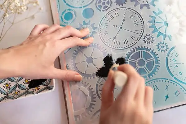
STENCIL
Stencils are tools that have pre-cut designs on them. You use it with paint or ink to create designs, draw, or write easily. They’re very popular in mixed media because you can create interesting layered backgrounds with them.
SYMMETRICAL
Symmetry in art involves areas on your artwork that seem mirrored. This doesn’t have to be like an exact mirrored image. You can use only portions of your artwork as a mirrored image.
T
TEMPERA
It’s a kind of paint that dries quickly, “in its diversity of transparent and opaque effects, and in the satin sheen of its finish, it resembles the modern acrylic resin emulsion paints.”
TERTIARY COLORS
You get tertiary colors when you mix equal amounts of one primary and one secondary color.
TEXTURE
The texture is a design element that we can see or feel. Texture can usually be felt with our hands. However, artists can create an impression of a texture with different painting techniques or the combination of different tools.
TINT
You create a tin of a color by adding white to it, to make it lighter.
TRANSLUCENT
If something is translucent, you can see through it, but not completely, whereas when something is transparent, you can completely see through it. For example, watercolors are translucent.
U
UNDERTONE
An undertone color can be seen through another layer of color on top of it.
V
VARNISHES
Varnish is used to finish a painting and protect it from light and dust while giving it an equally matte and glossy finish.
W
WARM COLORS
Warm colors are red, yellow, and orange (and their variants).
WASH
It’s a semi-transparent look of watercolor when you mix it with a lot of water.
WATER-BASED PAINT
It’s a paint that can be dissolved by water. In other words, they’re water-soluble paint.
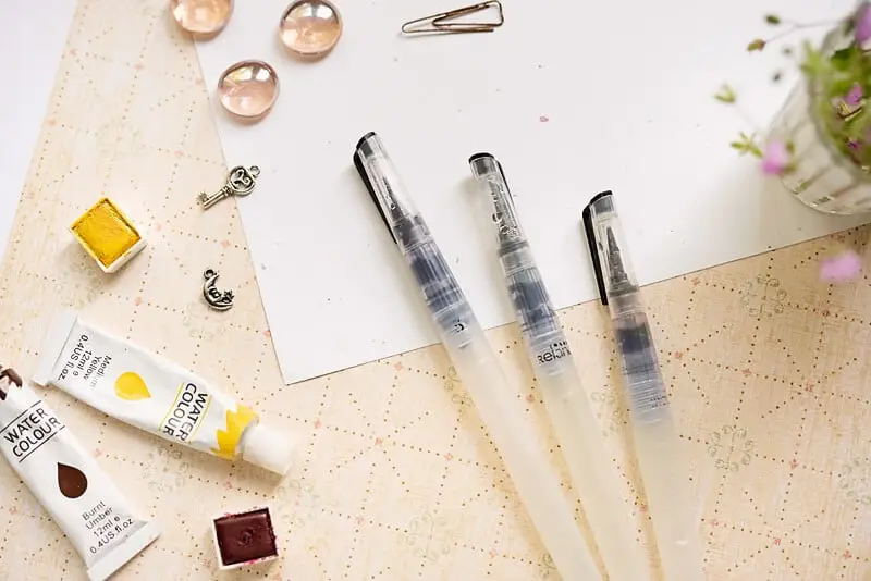
WATER BRUSH
It’s a special brush that has its own water container so you don’t need to dip into the water. They come in different sizes and are great for watercolor painting.
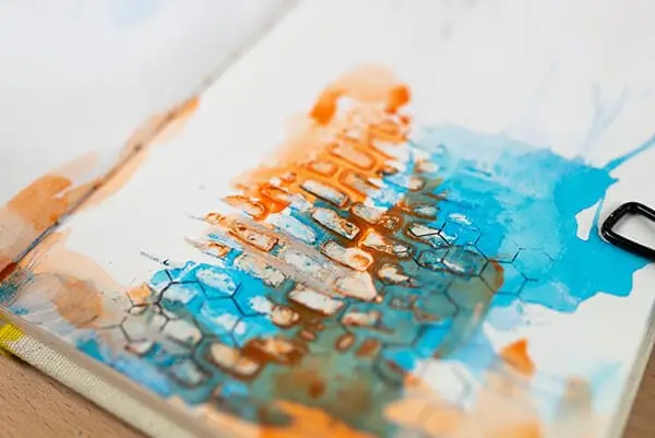
WATERCOLOR
It’s a translucent paint medium that you mix with water in order to paint with it.
WATERCOLOR PENCILS
They are colored pencils that react to water. First, you draw and color with them, then you can use a brush with water to activate it.
WET ON WET
A wet-on-wet technique is when you put some water on the paper first and then add more watercolor and water on top of that.
Don’t forget to download these painting terms so you always have them near when needed.
RELATED PAINTING ARTICLES
Top 11 Art Tools And Materials for Drawing and Painting in Your Art Journal
13 Simple Acrylic Painting Tips For Beginners That Will Transform Your Art
Acrylic vs Oil Paint Differences (Which Is More Beginner Friendly?)
How To Paint With Watercolor: A Beginner’s Guide To Watercolor Basics