Basic Color Theory For Artists: Make Stunning Art Every Time
A beginner artist will surely ask this many times: what’s color theory and how can I use it in my art?
Whether you’re a complete beginner or more advanced, this color theory for artists guide will help you learn new things or refresh the knowledge you already have.
My aim is to help you understand color theory so you can experiment with it and use it in your art process.
Today’s color theory is mainly based on Sir Isaac Newton’s color wheel which has 3 sets of colors: primary, secondary, and tertiary colors.
Color theory for artists covers basic definitions and terms, the theory behind the color wheel, as well as color combinations (also referred to as color harmony or color schemes).
Why is color theory important?
Color theory can help you understand colors in general, their combinations, relations, how they affect our perception of things.
The notion that colors can affect us psychologically is also something color theory tries to cover.
Great marketing companies today use color theory to trigger certain emotions among their audience. These marketing giants have proved that certain colors and their combinations influence our willingness to accept or reject something. How amazing is that?
When it comes to art, understanding color theory can help you decide on the color combinations to create a certain mood, for example, contrast, balance, unity, harmony, etc.
One of my favorite things to do in my art journals is to challenge the color theory. Why not? Nobody says you must follow it right to the point. It’s wonderful to learn new color combinations and use them with purpose, but it’s also a fun challenge not to.
Basic color theory definitions and terms
Here, I’ll list the basic terms used in the color theory for artists, so you can understand them and experiment based on them.
We’ll cover:
the color wheel
how to make a color wheel
primary colors
secondary colors
tertiary colors
warm vs cool colors
definition of a hue, tint, and shade
color combinations or schemes
psychological influence of color
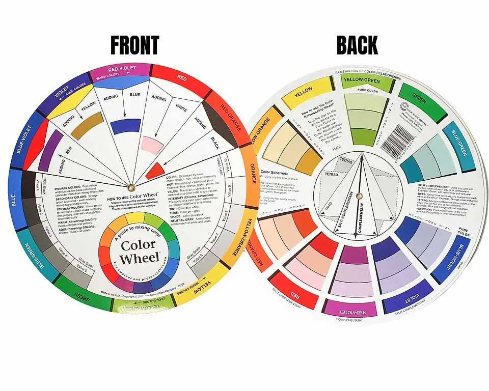
What is a color wheel?
A color wheel is an abstract circle of colors (hues) that shows the relationship between colors, specifically primary, secondary, and tertiary colors.
Primary colors
Primary colors are
Red
Yellow
Blue
They’re called primary because we use them to create all other colors (hues). Their combinations are like the origins of every other color.
In the image below, the three primary colors are in the triangle in the middle.
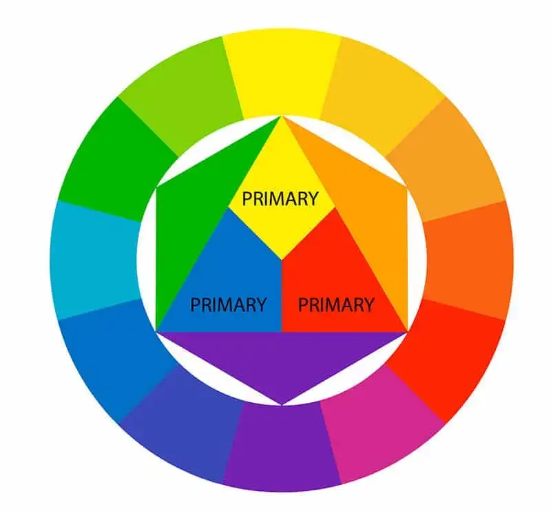
Bear in mind that the opposite doesn’t work here, we can’t mix colors to get blue, red or yellow.
And if you mix all three of them, you’ll get unflattering brown.
Secondary colors
The secondary colors are:
Purple
Orange
Green
We get these colors by mixing the primary colors in the following way:
Red+blue – purple
Yellow+red – orange
Blue+yellow – green
In the image below, if you focus on the triangles within the circle, you’ll see that the secondary colors are indicated as the mixtures of primary colors.
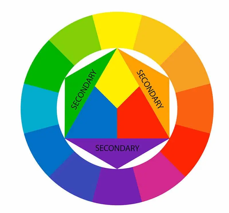
However, this is not so strict in the real usage of colors. You won’t always get the same purple when you mix red and blue. There are different blues and reds.
For example, there are warmer and cooler blues, so its mixture with red will give different purples.
That’s why you can try this idea to understand the colors you already have. Take your acrylic paint and watercolors. Experiment with what you have on you right now and mix colors to see what you can use in the future.
It’s fun to make swatches like this, or even your unique color wheels, with the names of the exact colors you have in your home. The ones you use all the time. Mix them, have fun, and make your own reference pages.
Here’s a short tutorial on making a color wheel.
Tertiary colors
Tertiary colors are the result of mixing one primary color with the nearest secondary color.
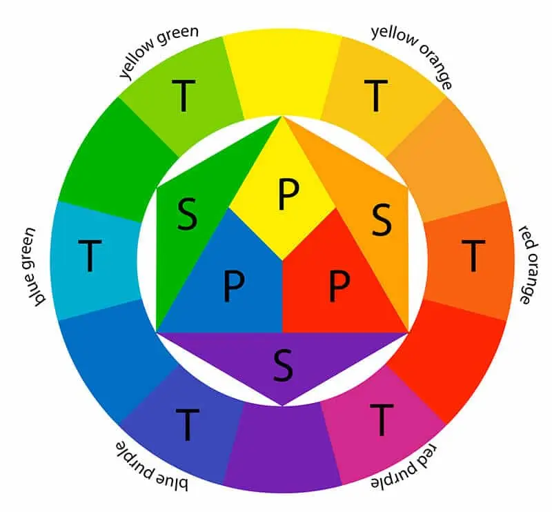
They’re also called intermediate colors:
Red-orange
Yellow-orange
Yellow-green
Blue-green
Blue-purple
Red-purple
What is a hue?
The dictionary definition of a hue is color.
So, when you think of primary colors, you can call them hues.
The Cambridge Dictionary defines the hue as a degree of lightness, darkness, or strength of a color.
What this means is that all the variations of blue are blue hues or all the light and dark versions of yellow are yellow hues.
If you have different yellows in your acrylic paint stash, you have yellow hues.
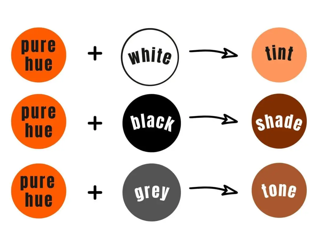
What is a tint?
To put it very simply, a tint is a mixture of any color with white.
Tint colors are often called pastel colors because they look lighter and softer than the original color.
What is a shade?
A shade is a mixture of black with any color from the color wheel to make it darker.
Simple, right?
What is a tone?
You get a certain tone of color by adding grey to it.
A tone refers to the lightness or darkness of a color.
In other words, grey tones down the intensity of colors because grey is neutral, without any pigment.
I’ve learned about grey through photography. To achieve true colors in a photograph, photographers rely on neutral grey to achieve color balance so the whites in the photograph are white, the blacks are black, reds are reds, etc.
If this balance isn’t done properly in a photograph, then, for example, you can end up with a white dress being blue.
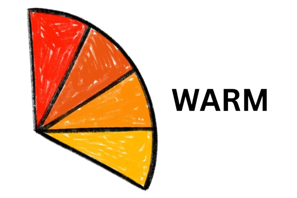
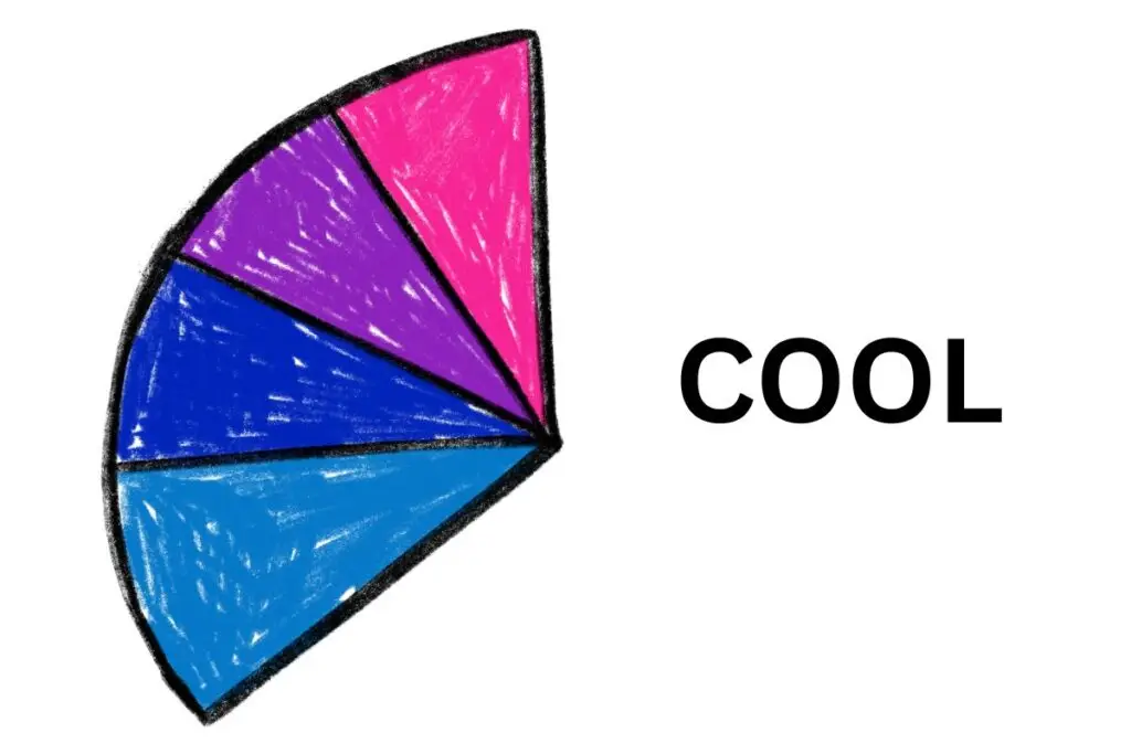
Think of warm colors connected to the sun, while warm colors are connected to water. If you look at them this way, it’ll be easier to see that the yellow or red are warm while the blue and green are cool colors.
How do you make a color wheel?
Although it looks complex, the color wheel is basically simple.
All you need to have in mind are these primary and secondary colors. Everything else just falls into place after that.
You can make your color wheel as simple as you want or as complex as you want.
Maybe you just want to include primary, secondary colors, and tertiary colors. Or you might want to add tints and shades as well (by adding white and black).
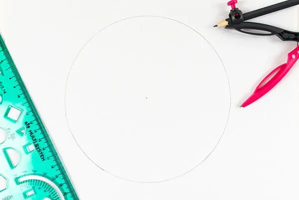
How to make a simple color wheel
For a simple color wheel you’ll need:
a compass
a sheet of watercolor paper (or any other thicker paper)
ruler
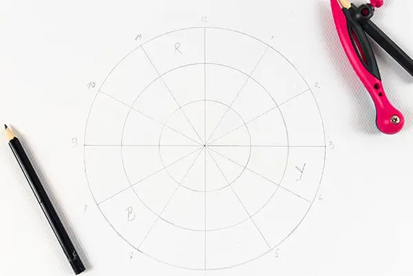
Take the paper and mark the center with a pencil. Now, make a circle with the compass but bear in mind you need to have enough space to paint in.
Next, take your ruler and draw two lines to make half circles.
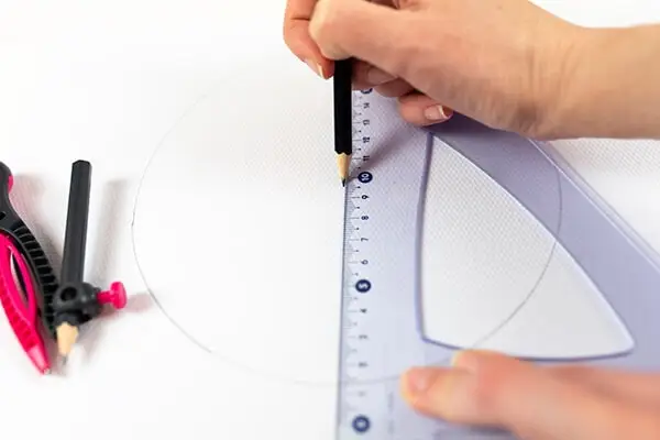
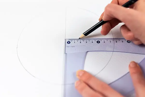
Now, write numbers from 1 to 12 around the circle, like you would in a clock.
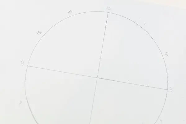
Next, draw lines to connect numbers 10 and 4, 11 and 5, and so on. These don’t have to be precise. The goal is to have 12 triangles in the circle that are approximately the same size.

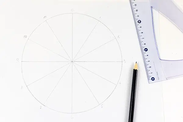
Now it’s painting time. Start with the primary colors: blue, red, and yellow and leave them to dry.
Where to put them?
Wherever you put the first one, place the other colors three spaces away. For example, paint a red triangle, then move 3 spaces and paint the fourth one yellow, skip three places again, and paint the fourth one blue.
When the primary colors are dry, paint the secondary colors between the primary colors, but not next to them.
After they’re dry, finish the wheel by painting the tertiary colors following the color combinations. For example, you’ll mix red and orange and paint it between those two colors.
A color wheel with tints and shades
Again, you’ll need
a compass
a ruler
watercolor paper
You’ll be making three circles: one big outer circle and two inner smaller circles.
First, do the same circle as we did above.
Then adjust the compass and make two smaller circles with the same space between each circle.
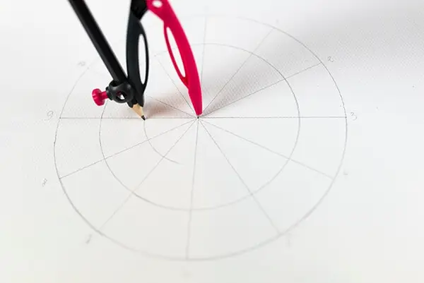
Paint the outer circle the same way we did in the simple color wheel.
Now comes the fun part: painting in the tints and shades.
Prepare black and white paint to make tints (adding white) and shades (adding black).
To make tints: mix white with each of the colors on the outer circle and paint them in the middle circle.
To make shades: when they’re dry, mix black paint with primary, secondary, and tertiary colors and paint them in the smallest inner circle.
GET AN ALREADY-DONE COLOR WHEEL WITH EVERYTHING YOU NEED FOR PAINTING
Color harmony: how do you combine colors?
Many beginner artists ask this all the time.
I’ll show you a few examples of combining colors that are usually used in art, painting, and design.
There are many ways you can play with combinations and trust me, they are endless.
1. Complementary colors
When you look at the color wheel, complementary colors are opposite each other and they create contrast.
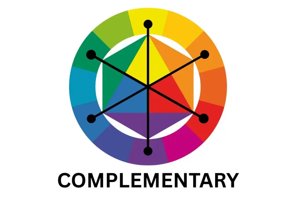
The traditional model in color theory defines these as complementary colors:
red-green
yellow-purple
blue-orange
2. Analogous colors
Analogous colors are colors next to each other on the color wheel, in groups of three.
For example, yellow, green-yellow, and green are analogous colors.
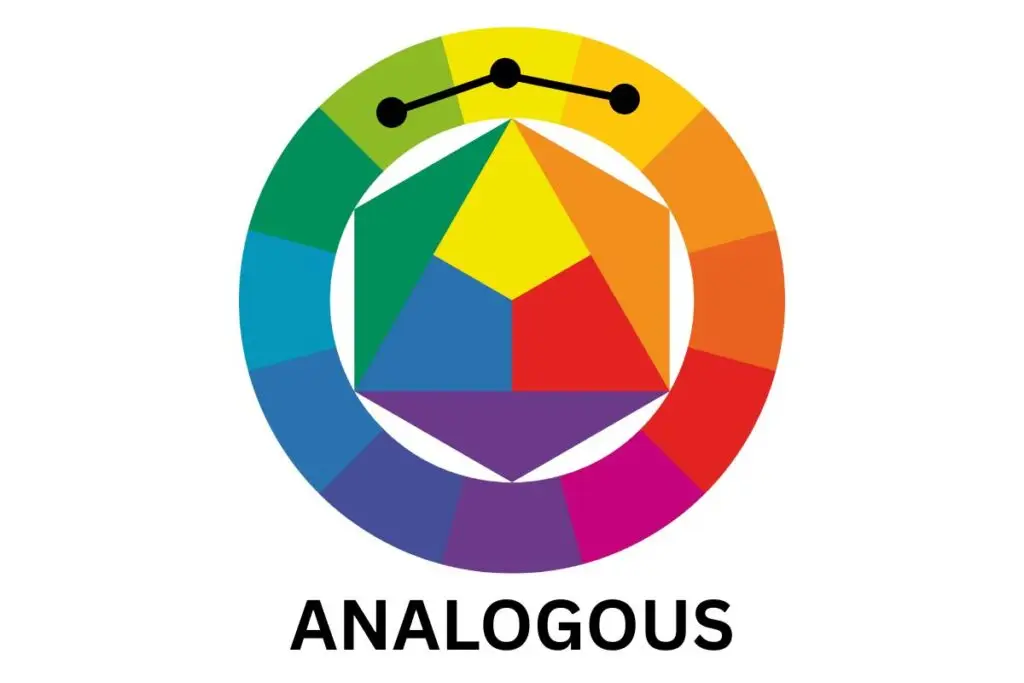
To be analogous colors, they need to have something in common or be connected mixing-wise.
To give you an example, yellow, green-yellow, and green are analogous because you mix yellow and green to get yellow-green. Consider them relatives or cousins. Each stands on its own but they have a tie that connects them to being one analogous family.
3. Triadic colors
What does the word triadic remind you of? A triangle.
This will help you see what triadic colors are on the color wheel.
When you form a triangle with equal sides on the color wheel, you connect three colors that create a triadic combination of colors.
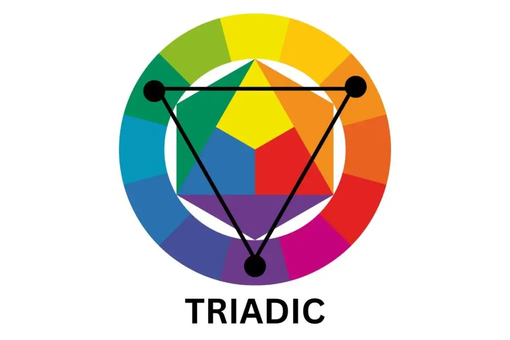
For example, if you put one triangle peak on purple, then the next peak should be on orange and the third one on green.
If you rotate the triangle and move just one space to the right, you get red-purple, yellow-orange, and green-blue.
4. Tetradic color combinations
Whereas triadic is like a triangle view, tetradic is more of a rectangular connection between colors.
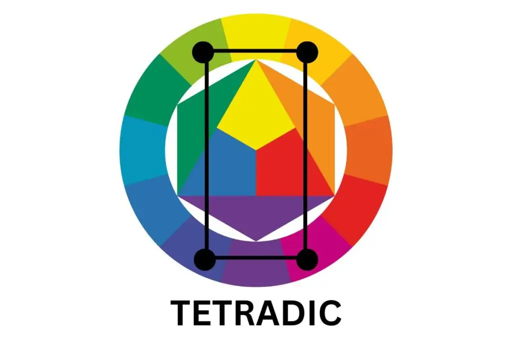
If you place an imaginary rectangular on the color wheel, here are some combinations you can achieve:
red purple-yellow orange-green yellow-blue purple
If you turn the rectangle to the left, you’ll get this color combination:
red – yellow – green – purple
You can play by turning the rectangle left or right and choosing color combinations you like.
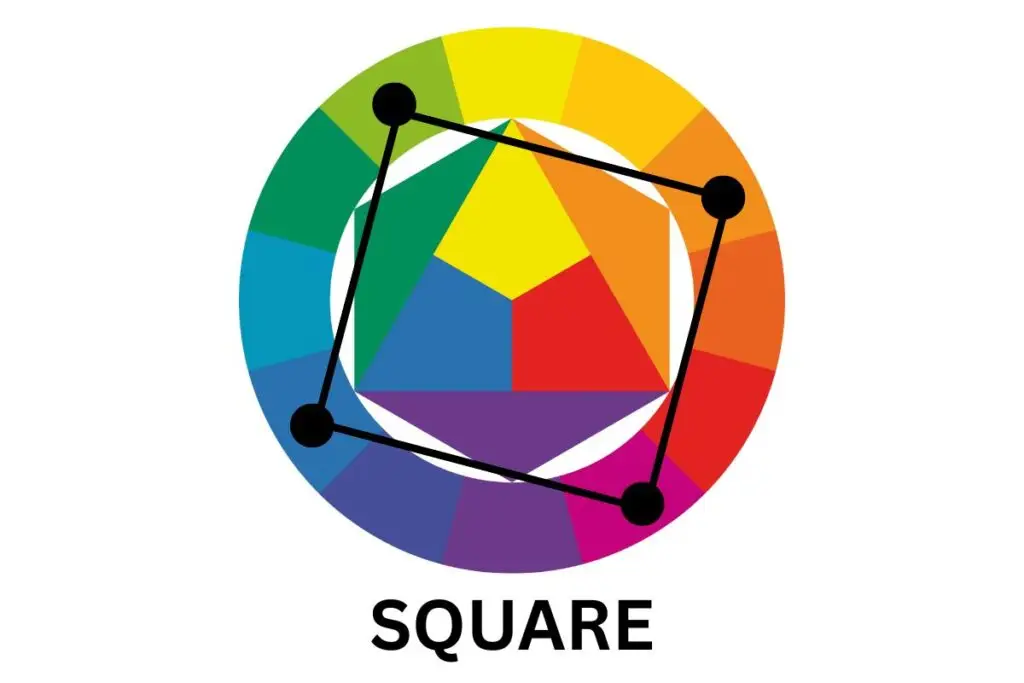
5. Square color combinations
Similar to the rectangle combination, it also uses 4 colors, for example:
red purple – orange – yellow green – blue
6. Achromatic color combinations
Achromatic means the absence of color, so achromatic colors are black, white, and grey. You can call them neutral colors.
These combinations, as well as their different shades, can be effective in art and design.
Try painting a portrait with only achromatic colors and you’ll be amazed at how interesting the painting is and how much depth it has.
That’s why we love black-and-white photos, right? They sometimes emphasize the mood of the photo better than other colors.
When I take photos of people and capture a precious moment between them, I’m instantly drawn to making this photo black and white because I want to emphasize emotions in the photo rather than the colors of the subjects and surroundings.
7. Monochromatic color combinations
And this is where it really gets interesting and challenging.
A monochromatic color combination means that you use only one color (hue) and its tints and shades, and no other color whatsoever.
So, for example, you can decide to paint flowers in a monochromatic combination using red. For this, you’ll mix white and black with red to get different tints and shades of red.
You can experiment with the amount of black and white you mix, so the number of color combinations here can go on and on.
Do colors have a psychological effect on us?
I’ve researched a lot of websites for this, and I must tell you that the psychology of color is not an exact science. It’s quite the opposite.
The thing is, the effect color can have on people hugely depends on the context including the emotional state of the observer, their origin, cultural heritage, life experiences, etc.
So, how can we say with positive certainty that the color red reminds us of passion and love when there are people in the world who have a bad experience connected to this color and thus don’t love it at all.
The influence of color on our minds isn’t universal.
Yes, there are general beliefs that red evokes passion, yellow triggers joy, while green reminds us of nature. But, this is hardly the case in every single situation.
That’s why it’s hard to pinpoint this and be exact.
However, the psychology of color does remain a crucial thing in the marketing niche. Marketing experts try to use colors to trigger feelings among their consumers.
Gregory Ciotti, in his article about the psychology of colors, states that “colors influence how consumers view the “personality” of the brand in question“.
The psychology of color can get complex and way too theoretical, so I wouldn’t try getting into details, you’ll just run in circles.
Instead, do what makes you happy. If yellow triggers joy for you, then treat it like that. If you find brown dull and just “yuck”, then use it when you want to say something is “yuck”.
For example, I never wear pink or buy anything that’s pink. It doesn’t speak to me, except when I buy presents for my niece, because she’s 5.
However, when I paint, I’m always naturally drawn to pink hues. Now go figure. I love how pink can be airy, especially when using watercolors.
Is color theory for artists something you can use?
It’s always up to you to use something in a certain way or not. You are the only maker of your art and the only judge of it. Experiment with color combinations from the color wheel or challenge these schemes to create something out of the box.
For example, the color wheel suggests that red and green are complementary colors and thus create contrast together. Well, I don’t know about the color theory, but I can’t stand this combination. I think I’ve never used this combination in my art journals, or my wardrobe.
Color theory for artists can help you, that’s 100% true. By studying it, you can understand colors more, as well as their combinations.
And, by observing the color wheel you can experiment with your paintings and notice things you like and don’t like. This way, you can make notes and swatches for future reference.
Finally, you can make your own inspiration board that includes your swatches and notes about color combinations. It’ll be unique to you and your preferences, and perhaps inspire a certain art style you’ve been wanting to achieve.