Painting With Feeling: Decoding the Emotional Language of color in Art

Color is a silent language used by artists for centuries, it speak directly to the heart.
Have you ever stood before a painting and felt an immediate, inexplicable wave of sadness? Or perhaps looked at another piece and felt a sudden boost of energy or anxiety?
If so, you’ve experienced the psychological power of color.
Master artists have not just painted things, they have painted feeling by carefully choosing the right palette to influence the viewer’s emotions.
“Color is a power which directly influences the soul.” Kandinsky
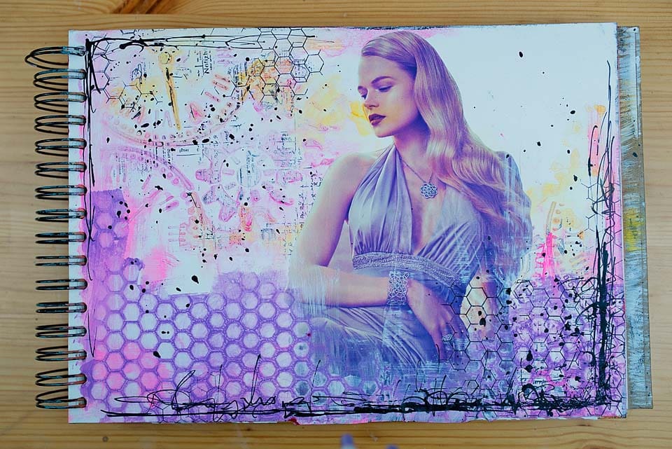
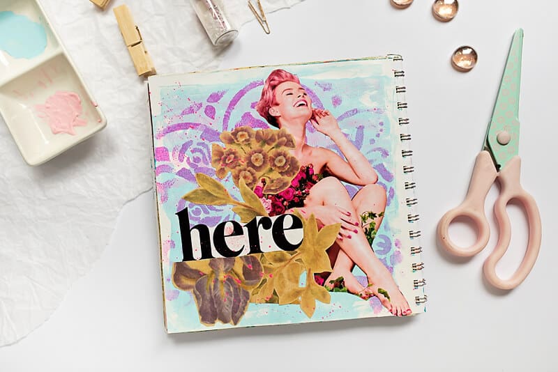
When you understand emotional color meanings, you move from simply using color to communicating with it. Your art becomes clearer, deeper, and more powerful. Whether you’re painting whimsical faces, layering mixed-media, or choosing a palette for an art journal, color is your co-author in telling your story.
Let’s explore the emotion of color and how you can use it in your artwork.
What Are Emotional Color Meanings?
Emotional color meaning is the feelings, moods, and associations we give to colors.
These meanings come from psychology, culture, nature, and personal experience.
For example:
Blue often feels calming because of the sky and sea but sometimes it can be depressing and cold depending on the blue and how it is used.
Yellow feels hopeful because it reminds us of sunlight.
Red feels energetic because it’s the color of fire and passion.
While every artist has their own emotional history with color, these general meanings are a wonderful starting point.
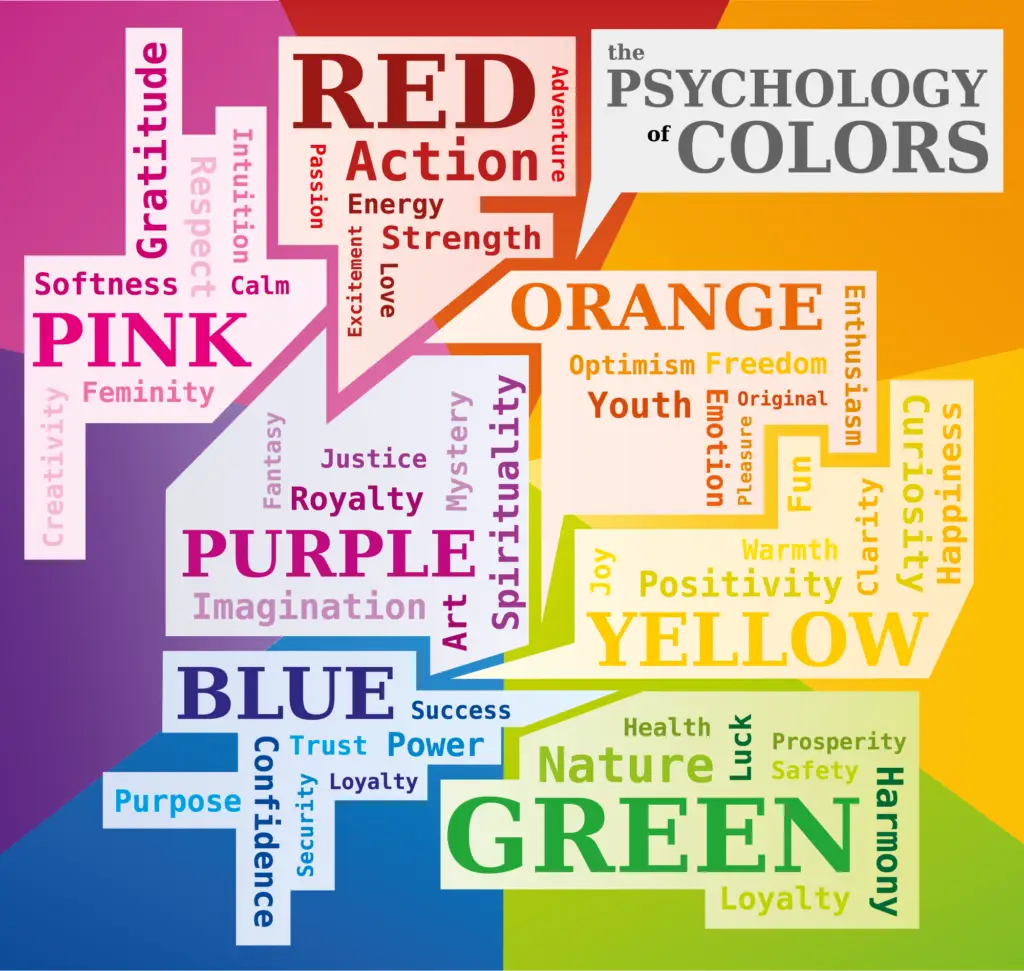
Red
Emotions: Passion, Energy, Danger, Love, Anger, Urgency, Courage.
The Deeper Story: Red is the most powerful color. It’s the color of blood, fire, and the heart. It demands attention and can literally increase metabolism and respiration. In art, it’s your tool for raw, unfiltered expression.
When to use:
1- When your page needs a bold focal point
2- To express intense emotions like love, rage, or powerful desire.
3- To create a sense of movement, heat, or dramatic conflict.
4- When you want your viewer to feel something immediately
Art Tip:
Pair red with calming neutrals like beige, gray, or cream to let it sing without overwhelming the senses. A splash of red in a muted composition is unforgettable.
🧡 Orange
Emotions: Enthusiasm, Creativity, Warmth, Confidence, Friendliness.
The Deeper Story: Orange combines the energy of red with the joy of yellow. It’s less aggressive than red but more vibrant and earthy than yellow. It stimulates social interaction and creativity, feeling like a warm, inviting gathering.
When to use:
1- To create warmth without the intensity of red
2- When you want your art to feel optimistic or alive
3- For playful, expressive faces and backgrounds

Art Tip:
Use watered-down orange as a wash for backgrounds to create an instant sunny, optimistic atmosphere.
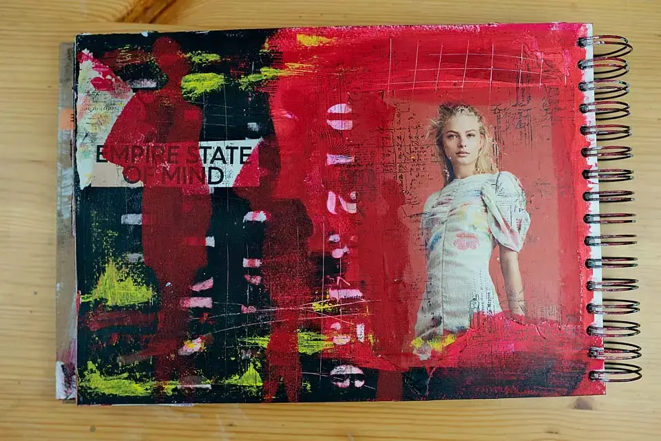
💛 Yellow
Emotions: Joy, Hope, Intellect, Anxiety.
The Deeper Story: Yellow is the color of the sun so it’s illuminating and energizing like the sun. It activates memory and sparks nervous energy. Its flip side, when muted or green-toned, can evoke jealousy or anxiety.
When to use:
1- To literally brighten a page and lift the mood.
2- When you want to express freedom or optimism or childlike play
3- To highlight your most important elements so the eye sees it first
Art Tip:
Yellow is a powerful highlighter, you can use it to draw attention to areas you want the eye to notice first.
Green
Emotions: Harmony, Growth, Renewal, Envy, Grounding.
The Deeper Story: Green is the great balancer, located in the center of the color spectrum. It’s the color of life, rest, and restoration. It soothes the soul because it’s the color we see most in nature. Its negative associations (envy, sickness) are often tied to its more acidic, unnatural shades.
When to use:
1- To create soothing spreads
2- When journaling about personal growth, healing or a new beginnings.
3- When you need a restful, calming palette
Art Tip:
Muted sage and olive paired with soft browns and creams make a peaceful calming pages.
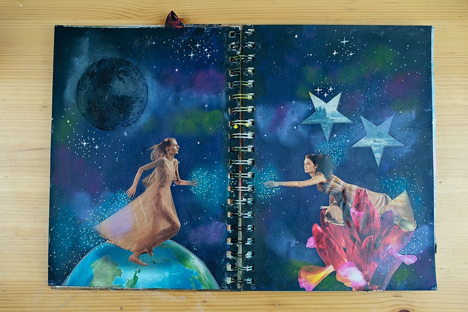
💙 Blue
Emotions: Calm, Trust, Sadness, Stability, Reflection.
The Deeper Story: Blue is the world’s favorite color. It’s linked to the sky and sea, evoking feelings of vastness and stability. It can lower heart rate and suppress appetite. Dark blue conveys professionalism and intelligence, while light blue feels serene and spiritual. Blue has negative associations such as sadness, depression (feeling blue), coldness and Isolation.
When to use:
1- When your mood is reflective
2- When you want to create calm, quiet spaces
3- When telling deeper emotional stories
Art Tip:
Layer ultramarine, indigo, and a touch of white for beautiful depth. This will give you a perfect nighttime or dreamlike theme.
💜 Purple
Emotions: Luxury, Spirituality, Intuition, Magic, Creativity.
The Deeper Story: Historically, purple dye was rare and expensive, linking it to royalty and wealth. It’s the color of the imagination, bridging the gap between the energetic red and tranquil blue. It’s deeply connected to the subconscious and all things mystical.
When to use:
1- For intuitive art journaling
2- When exploring dreams or inner wisdom
3- To add mystery or elegant contrast
Art Tip:
Mix purple with metallic gold for a luxurious, Klimt-inspired feel (perfect for your whimsical faces!).
🩷 Pink
Emotions: Compassion, Nurturing, Self-Love, Playfulness, Femininity.
The Deeper Story: Pink is a passive red, it carries the energy of love but without the aggression. It’s calming, associated with unconditional love and tenderness. Hot pink shares more of red’s vibrancy, while dusty rose feels gentle and nostalgic.
When to use:
1- For comforting, gentle spreads
2- When journaling about love or healing
3- For whimsical characters and expressive portraits
Art Tip:
Combine different pinks such as dusty rose or hot pink for a beautiful emotional range.
🤍 White
Emotions: Purity, Clarity, Simplicity, Emptiness, New Beginnings.
The Deeper Story: White is all colors combined. It represents cleanliness, clarity, and openness. In art, it’s not just the absence of color; it’s an active element that provides breathing room and emphasizes everything around it.
When to use:
1- To add space between busy elements
2- When you want the art to feel airy, clean and minimalist.
3-To highlight the emotional impact of other colors
Art Tip:
Leave intentional white space to make your focal point pop.
🖤 Black
Emotions: Power, Elegance, Mystery, Grief, The Unknown.
The Deeper Story: Black is the absorption of all light. It’s sophisticated, and strong. It can be intimidating or sad, but it also provides a powerful foundation and deep contrast, making other colors appear more vibrant.
When to use:
1- To create bold contrast
2- When you want emotional intensity
3- As a grounding color in chaotic spreads
Art Tip:
Use black sparingly because small details can have huge impact.
⸻
🤎 Browns & Earth Tones
Emotions: Stability, Reliability, Comfort, Nostalgia, Warmth.
The Deeper Story: Brown is essentially dark orange. It’s the color of earth, wood, and stone. It’s grounding, honest, and supportive. It evokes a sense of vintage, heritage, and cozy comfort.

When to use:
1- For vintage or nature-inspired pages
2- When grounding strong colors
3- When exploring memory and storytelling
Art Tip:
Avoid flat browns. Add a hint of its complementary color (blue) or a touch of purple/red to create rich, complex, and dramatic browns.
Masters of Emotion: Famous Artists and Their Palettes
While almost every artist uses color thoughtfully, some are masters at expressing their feelings with color.
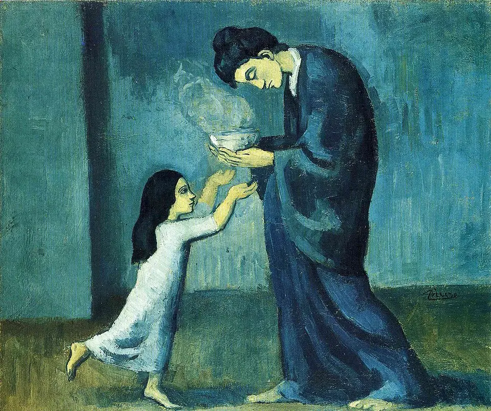
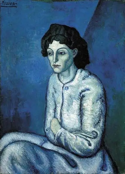
1. Pablo Picasso: The “Blue Period”
Between 1901 and 1904, sinking into a deep depression following the suicide of a close friend, Pablo Picasso painted almost exclusively in shades of blue and blue-green.
He didn’t just use blue as a background; he saturated his subjects such as beggars, the blind in the color. He managed to create a suffocating sense of sadness, coldness, and isolation.
“Colors, like features, follow the changes of the emotions.” Pablo Picasso
Key Example: The Old Guitarist (1903). The bent, weak figure is washed in muted blues. The only hint of warmth is the brown guitar resembling his only hope and companion, which stands out against the sea of sorrow.
Shawn Grenier | The Canvas

Pablo Picasso
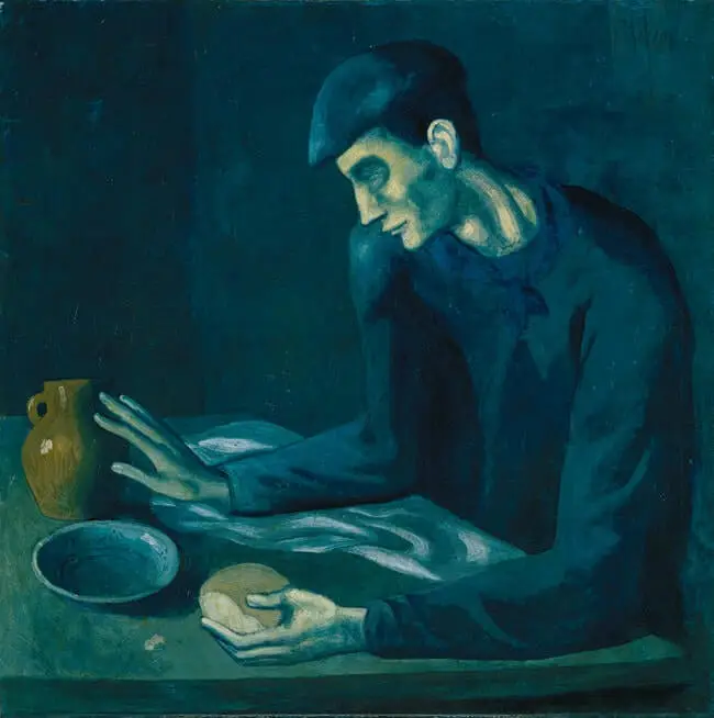
Pablo Picasso
2. Vincent van Gogh: The Anxiety of Yellow
Van Gogh was a master at translating inner turmoil onto canvas. While he used many colors brililantly, his use of yellow is particularly profound.
For Van Gogh, yellow represented light, gratitude, and hope (as seen in his beloved Sunflowers). However, as his mental state deteriorated, the yellows became harsher, more acidic, and manic. He used intense, clashing yellows alongside deep blues to create vibrating tension rather than harmony.
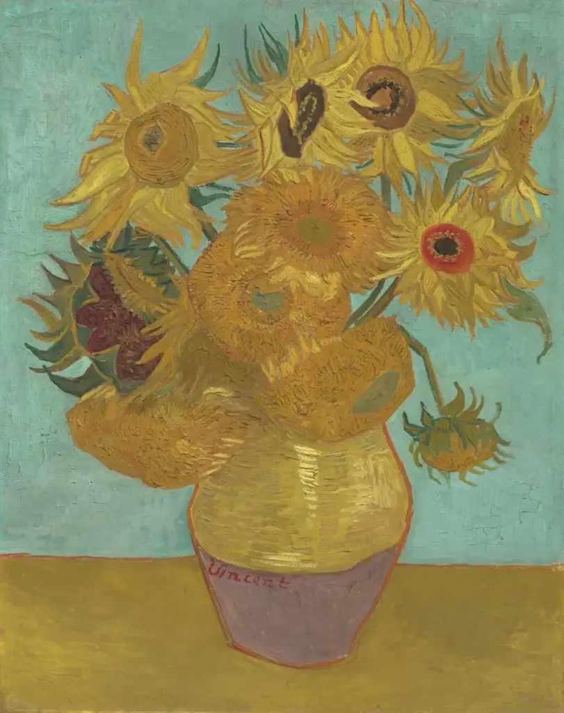
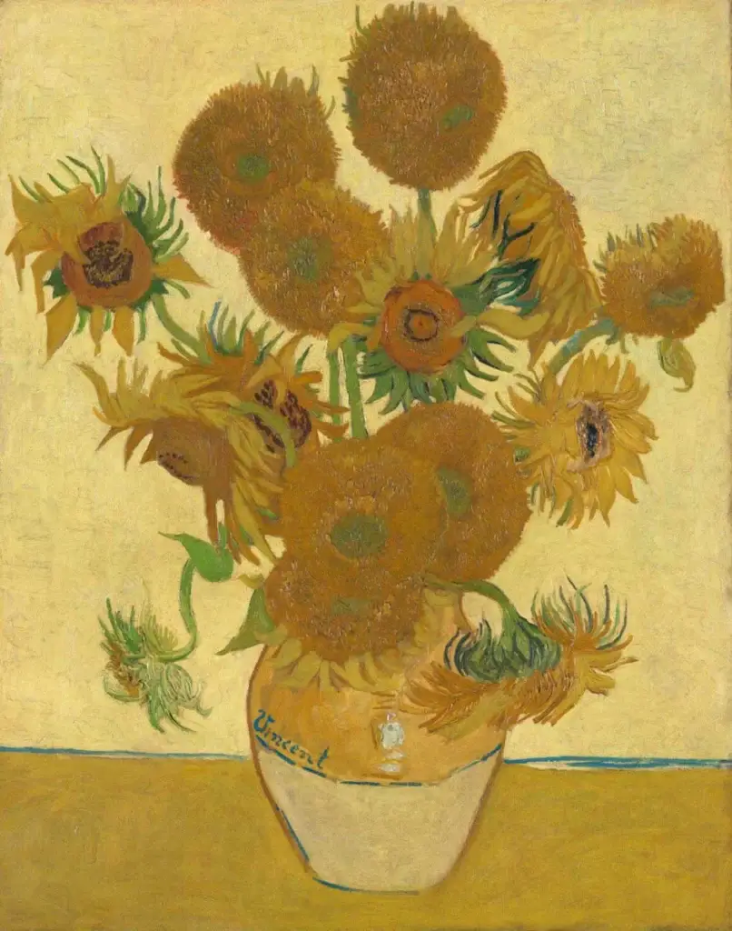
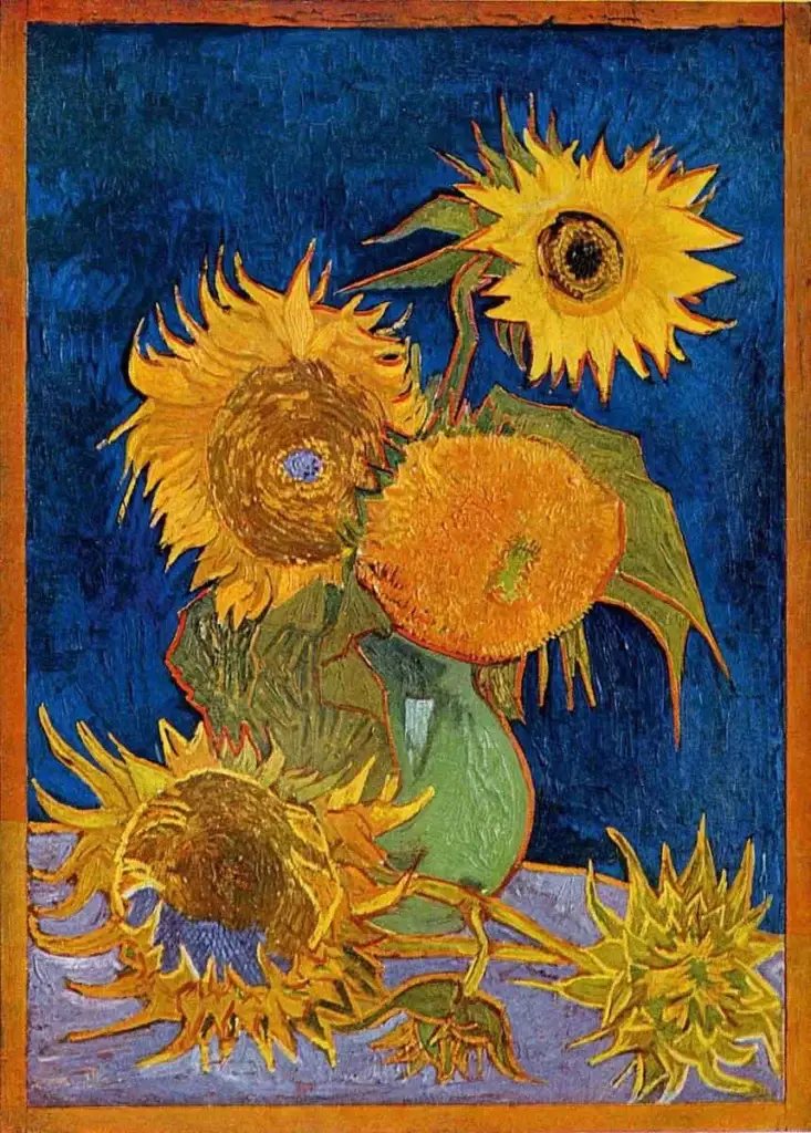
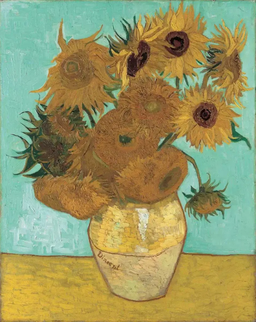
I highly encourage you to check out this very interesting Fun Facts about Van Gogh’s Sun flowers
3. Mark Rothko: The Abstract Emotional Envelope
Mark Rothko didn’t paint subjects; he painted raw human emotion. As a leading figure in Abstract Expressionism and Color Field painting. He wanted viewers to cry before his pictures, experiencing the same “religious experience” he had when painting them.
He used large, soft-edged rectangles of glowing color that seemed to hover and pulse. By removing figures and landscapes, he left only the pure emotional weight of the color.
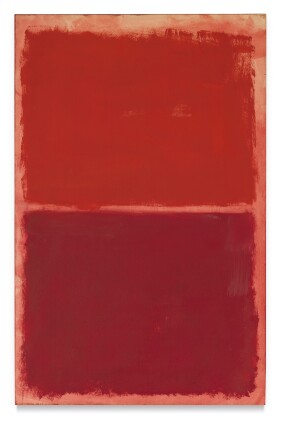
You can check all of his art work and the color combinations on the National Gallery of Art
4. Henri Matisse: The Radical Joy of Red
Contrasting the somber tones of others, Henri Matisse, a leader of the “Fauves” (Wild Beasts), used color with explosive, liberated joy. He didn’t care if a color was realistic; he only cared about the feeling it produced.
Matisse often used red not for anger, but for warmth, enveloping comfort, and vibrant energy. He flattened perspective and used bold blocks of primary color to create a decorative, almost overwhelming sense of harmony.
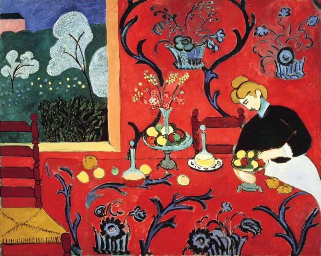
Key Example: The Dessert: Harmony in Red (The Red Room) (1908). In this painting, red is not a background; it is the entire world. The wall paper and tablecloth merge into one vibrant red plane, creating a space that feels intensely warm, domestic, and alive.

Henri Matisse
If you want to learn more about Henri Matisse and his use of color I suggest checking out Musings on Art
🎨 How to Use Emotional Color in Your Art Journal
Here are simple ways to bring emotions in your art using color:
1. The Mood-First Approach:
Before you pick up a brush, close your eyes.
Ask: “What am I feeling today?” Let the answer guide your color choice. Don’t think, just feel and reach for the tube that calls to you.
2. Mix Emotional Colors With Symbolic Elements
You can strengthen your message by pairing emotional colors with symbolic imagery.
For example:
Blue + Wavy Lines + Birds = A story of freedom and calm.
Red + Shattered Lines/Hearts = A story of broken passion or intense energy.
Green + leaves = A story of new growth and healing.
Pink + flowers = love
3. Let Colors Guide Your Story
Instead of planning every detail, let the emotion lead and follow the color. Put down the colors and then ask, “What do these colors want to tell me?” Let the mood of the colors guide your marks, shapes, and figures.
4. Try Seasonal Color Emotions
Tune your art into the rhythm of the year.
Winter: Icy blues, stark grays, shimmering silvers (reflection, quiet).
Spring: Fresh greens, tender pinks, buttery yellows (renewal, hope)
Summer: Vibrant reds, juicy oranges, electric turquoise (energy, joy).
Autumn: Burnt oranges, deep browns, ochres, maroons (transition, comfort).
5. Create a Color Diary
Dedicate a section of your journal to color studies. Create pages for individual colors. On your “Red Page,” use only reds and write down what red means to you. Over time, this becomes a priceless personal reference guide. You can even create an art journal just dedicated to color. For example in the Red section, on one page you can try to be completely free and follow your heart and on another page choose red but try some of the color combinations suggested on the blogs about color
Basic Color Theory For Artists: Make Stunning Art Every Time
How To Choose Colors For Art Like A Pro – Guide For Beginners
Color Schemes For Art Journaling: 10 Beginner-Friendly Combinations
Final Thoughts:
Your art journal is a safe, beautiful place to express who you are and color is one of your strongest tools.
Once you begin noticing emotional color meanings, you’ll start choosing palettes more intentionally, connecting deeper with your artwork, and expressing feelings you didn’t have words for.
Color becomes your voice.
And your pages become your story.
Happy Creating
Salwa