How to Choose Colors For Art Like A Pro – Guide for Beginners
Color combinations can help you decide on the colors for your art rather than just guessing what color of acrylic or watercolor paint to use. However, I know these can be overwhelming for a beginner.
So, I’m going to introduce basic color combinations here and then give you suggestions and advice on how to decide which colors to use on your art journal pages (or art in general).
Reminder: You don’t have to be an expert. By learning just a few things, you can start creating art that’s more interesting and visually appealing.
I’m focusing on art journaling in this post, but all of this can also be used in any type of art expression.
What is a color scheme/combination?
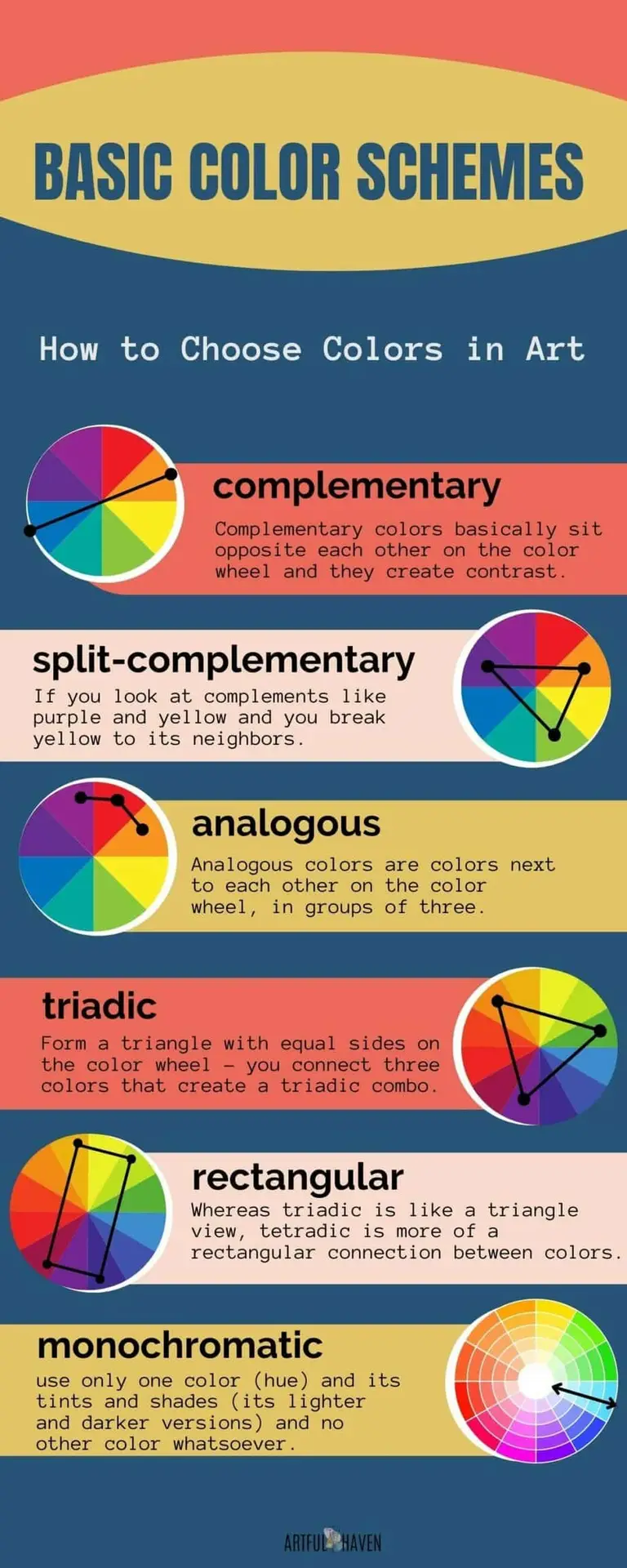
Color schemes are just the combinations of colors you use for your art. There are 6 basic color schemes artists have been using forever.
Basic color schemes
- Complementary
- Split-complementary
- Analogous
- Rectangular
- Triadic
- Monochromatic
Sounds daunting? It doesn’t have to. When you hold a color wheel in front of you, then these color schemes become obvious and are easier to understand.
To make it easier for you, I’ll try to explain each shortly without all the overwhelming theories. By exploring the color theory, you can learn more things about colors and their combinations.
But for this purpose, we’ll focus on the basic color schemes and then I’ll share how to actually use color schemes to create amazing art (even without the color wheel).
Tip: If you have a color wheel in front of you, look at it while you read this.
Complementary
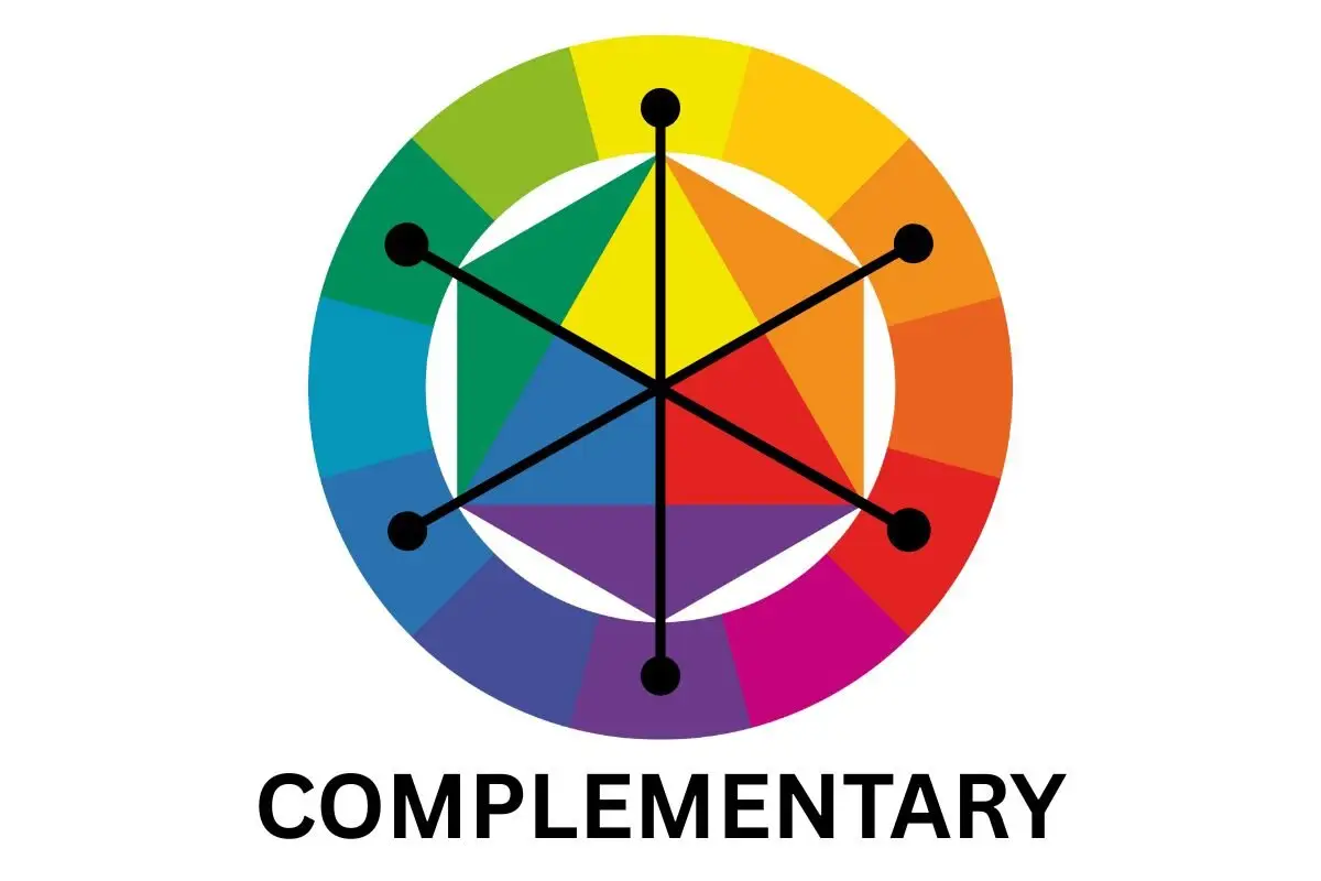
Complementary colors basically sit opposite each other on the color wheel and they create contrast.
Split-complementary
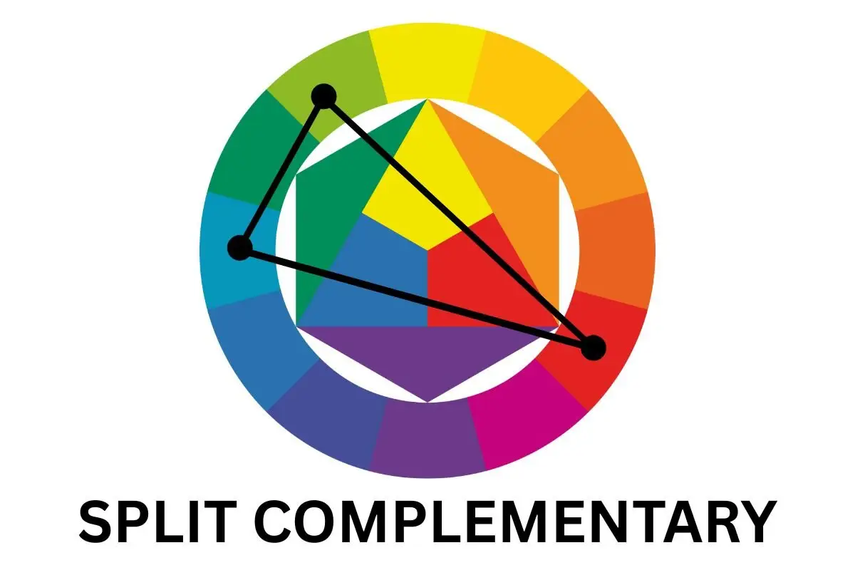
Split-complementary means that you split the complementary relation. So, if you look at complements like purple and yellow and you break yellow to its neighbors (yellow-orange and yellow-green) you get the split-complementary combo: purple + yellow green + yellow-orange).
Analogous
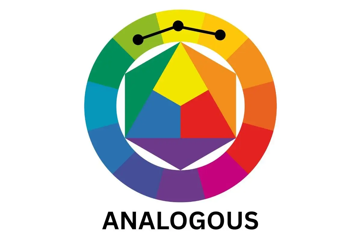
Analogous colors are colors next to each other on the color wheel, in groups of three. You can also add the 4th color that sits opposite the middle color in the analogous group.
Triadic
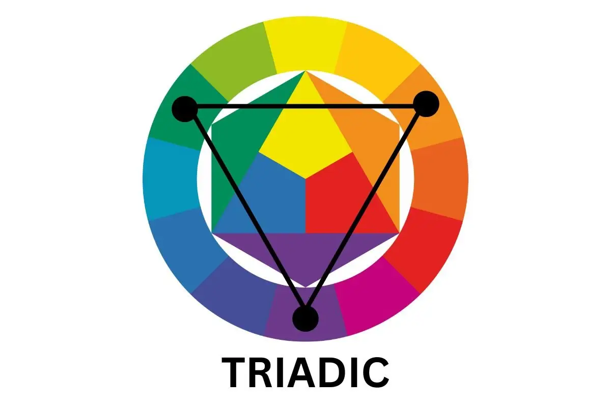
When you form a triangle with equal sides on the color wheel, you connect three colors that create a triadic combination of colors. These colors are evenly placed on the wheel (there’s the same amount of colors between each of them).
Rectangular (tetradic)
Whereas triadic is like a triangle view, tetradic is more of a rectangular connection between colors.
Monochromatic
A monochromatic color combination means that you use only one color (hue) and its tints and shades (its lighter and darker versions) and no other color whatsoever.
Why are color schemes important?
Color combinations can help you in many ways to make a piece of art that has an impact on the viewer.
- You’ll be able to create more balanced artworks that just make sense visually
- Color schemes help you create contrast easily without adding more elements
- You can create interesting effects with color that will enchant the viewer
- By using different color combinations, you can evoke different moods and feelings
- You can also tell a story by creating a certain mood or vibe
Using color combinations in your art is an amazing way to speak through painting. It takes only a little to learn a few things and play around with them. I promise you, the results will be amazing.
How to choose colors for your art journal page?
Here, I’ll share some of the ways you can decide on which colors to use without having to look at the color wheel all the time.
Also, my best advice is to use the color wheel and the color schemes while you create.
For example, sometimes while I paint, I realize something is missing. Then, I check the colors and see what I can add to spice things up a bit.
If an art journal page looks dull to me, I’ll check which color I could add to make it more interesting, and then I’ll add a few details in this color. This makes a world of difference.
Your focal image
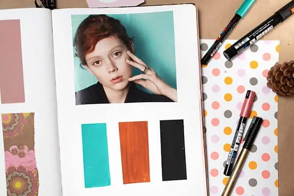
If you already know you’re going to use an image on your page, use it to choose colors for the background or other elements. Oh, man, this gives you so many different possibilities for playing with colors and creating different effects.
For example, if you have an image from a magazine, and it’s mostly orange, you can choose your colors like this:
- Keep it in the orange family and do only shades, tints, and tones
- Keep it in the warm family and use only warm colors
- Go the opposite and choose orange’s complementary color blue to create contrast
- When you start thinking like this…you’ll get plenty of ideas
Another photo reference
This is similar to the example above. If you’re not sure which color scheme to choose, find a photo you love and use its colors. Play with them and their combinations. Having a photo reference is a great and simple start.
Don’t use colors as they are, choose their variants
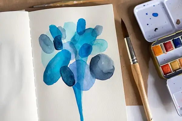
This means that you can always choose one color and then add others by only making the main one lighter or darker. Then you can create a monochromatic page…yeeees.
For example, if you choose red for the background, add some white to it and blend it. This creates a lighter variant of red. Then, mix some black + red and add details or shapes to the background.
By adding black or white to your main color, you create many different variants and can only paint with them.
You’ll learn a lot this way about monochromatic schemes and have so much fun.
Use one warm and one cool color
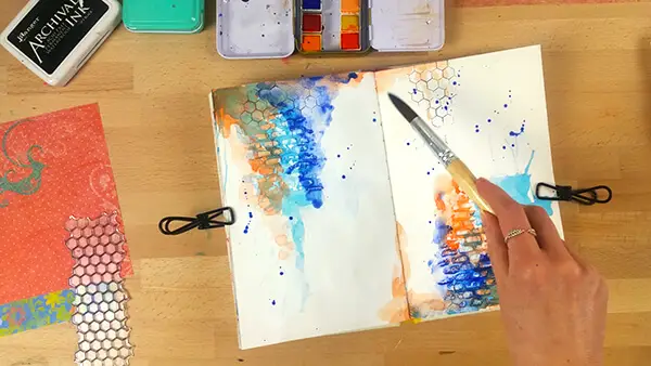
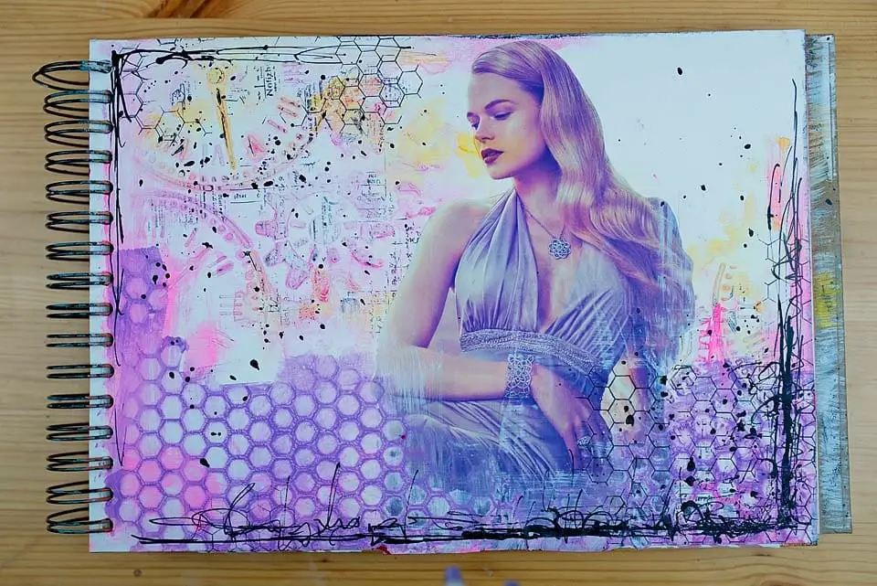
While you can make amazing visuals by using only warm or cool colors, why not use them together for contrast? The best example is purple and yellow, or orange and blue.
Use black and white and add one color
This is one of my favorite ways of choosing colors. What I do is choose a black and white image, make a grey/black/white background, and then add an element in color.
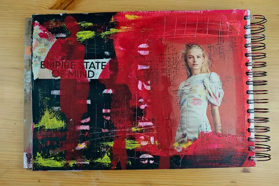
Or, I create a background in one color, let’s say red, and then add a black-and-white image or paint something.
Don’t use colors in equal amounts
If you combine two colors, for example, play with how much color is represented on your page. You’ll get amazing results if you make one main color and one supporting color.
This means that you can use one color for almost all elements, and then add a second color here and there, just to support the main one. If you use more colors, do the same trick.
Color combinations that you’ll love
Being a photographer and an artist for a long time, I’ve learned how colors work together and which ones give amazing results.
So, I’m sharing a few color combinations that I usually use and they just work beautifully together.
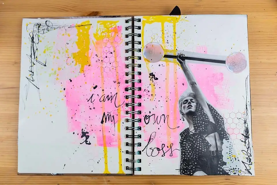
Pink and yellow
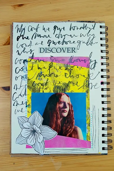
I use this one often and I believe I’m in love with it. It’s just an amazing combo. You can also add white or black to these two, and the results will be amazing.
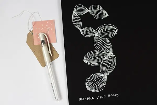
Black and white
This sounds too plain and simple but it’s a combination that always works and has a strong impact on the viewer. With this combo, you can play with stencils and masking, patterns, doodles, geometry, photos, etc.
I once saw an artwork that had a black background and a white detail, like a dot. It was simple but it still captured my attention. Try playing with this combo and see where it takes you.
Vintage color scheme
Vintage style has been popular for a long time and no wonder: the vintage color schemes simply enchant us.
So, if you want to achieve this look, use these color schemes: white, bright pink, brown, and desaturated colors like beige, light grey, etc, and mostly tints (created by adding white to a color).
Bright color schemes
Bright color combinations create a different vibe than vintage ones. They’re cheerful, full of color, energetic, positive, etc. To achieve this look, you can use these combinations:
yellow + blue
pink + yellow
purple + orange
red+yellow+blue
pink+yellow+light blue
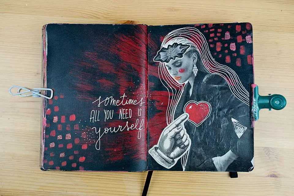
Grungy vibes
This is one of my favorites. And it’s fairly easy to choose colors. Grunge is based on a darker scale of colors. This means that you can use:
Black, red, grey, white.
Plus, you can use other colors like blue, yellow, or green but very dark shades of it (by adding black to it).
How to create contrast with colors?
Use the color wheel. Choose complementary colors and combine them (but not mix them together because they create a muddy color when mixed!), like blue and orange, purple and yellow, and red and green. You can use their shades and tints as well (lighter and darker versions).
And of course, black and white are great for contrast.
Another example is if your background is mostly red, add a green element. Or if you have an image in yellow, put it on a purple background.
How to create balance with colors?
That’s what we’ve been talking about so far. So, if you want to create a balanced art journal page, use the color wheel and pick the color schemes that I described at the beginning of this post.
I love using complementary color schemes, but also analogous and others. All of them are worth trying out. You’ll love the play and the results. Not to mention that you’ll learn a bunch of new things.
Also, don’t forget to have fun and not stress out over this.

