Color Theory for Beginners: The Essential Guide to Creating Stunning Art
Did you ever sit in front of your art journal thinking, “Why do these colors look weird together?” Or maybe you keep using the same 3 colors over and over again because it feels safe… but also a little boring?
Trust me, you’re not alone. Choosing the right color scheme for art journaling can make all the difference in bringing your pages to life.
Not only Color is one of the easiest ways to transform your art, but it’s also something we tend to overthink. The good news?
You don’t need a degree in color theory to use color beautifully.
Color is feeling, instinct, memory, emotion… and with a few simple combos, you can create stunning pages you LOVE.
This is your friendly, practical, Artful Haven guide to choosing and using color in a way that feels simple, playful, and confidence-boosting. You’ll learn:
The 10 easiest color combinations for beginners
Master artist examples for each scheme
Mindful art journal prompts
Common mistakes (and how to fix them fast!)
Answers to your most asked color questions
Practical tips to make your colors shine every time
Let’s unlock your personal color confidence.
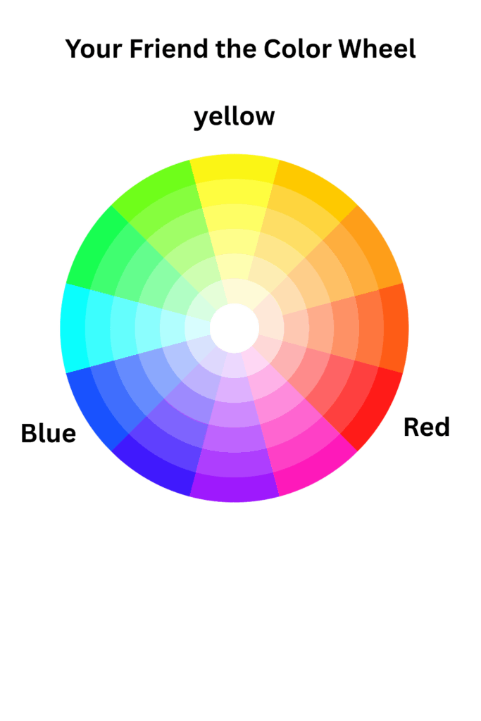
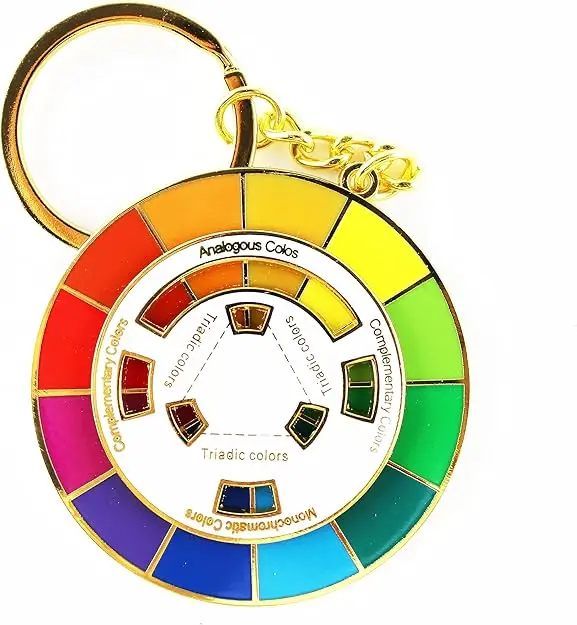
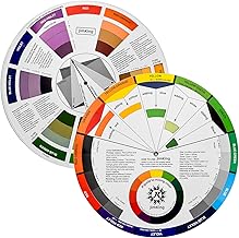
What Are Color Combinations (Schemes)?
Color schemes are combinations of colors that naturally look good together. They have been used by many artists for a long time. let’s think of them as recipes for color, if you follow the recipe, you’ll create harmonious, eye-catching pages every time. Of course these recipes are only suggestion like any information you learn about art, take what you like and leave what you don’t because there is no right or wrong in art.
Why Color Harmony Matters (and Why Your Pages Sometimes Look “Off”)
Color harmony is simply the relationship between colors. Usually it’s what makes a page feel peaceful, exciting, bold, or magical.
Color harmony helps you:
✔ Create powerful moods
Soft blues = calm or sad
Golden yellows = hopeful
Warm reds = energy
✔ Lead the viewer’s eye
Want the focal point to be the face?
Use contrast or a strong color near the most important object in your art journal page.
✔ Tell a visual story
Your colors are talking. When they harmonize, the message becomes beautiful and clear.
10 Artist-Approved Color Combinations to Use in Your Art Journal
Below are the simplest, beginner-friendly color combinations you can use today.
Each one includes:
What it is the color combination
A famous artwork example
A beginner-friendly explanation
A mindful art journal prompt (or several!)
A common mistake + how to fix it
Let’s jump in.
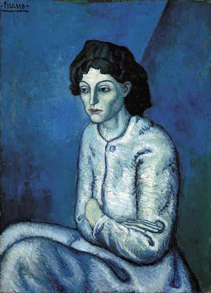
The One-Color Wonder (Monochromatic)
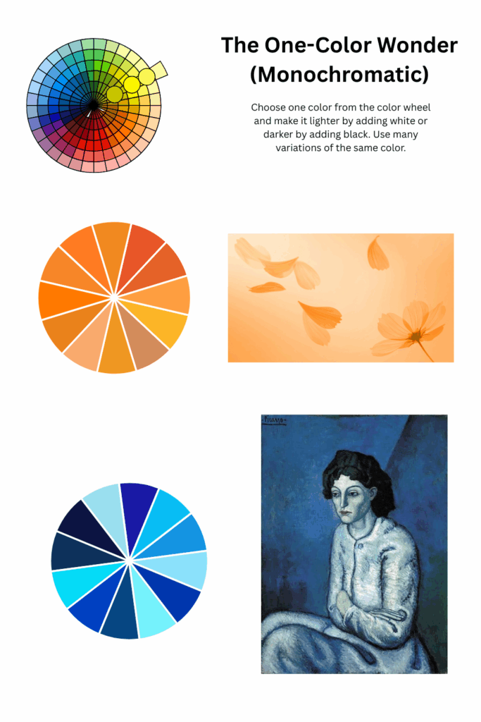
What it is: Using a single color in a range of tints (adding white), tones (adding gray), and shades (adding black). This is the perfect starting point for beginners, teaching you about value and depth.
Master Artist Example: Picasso’s Blue Period is a powerful lesson in how one family of blues and blue-greens can express loneliness, sadness, peace, and depth all at once.
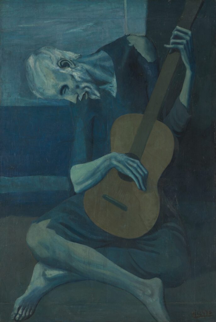
Source: The Art Institute of Chicago
Link: https://www.artic.edu/artworks/28067/the-old-guitarist
Mindful Art Journal Prompts
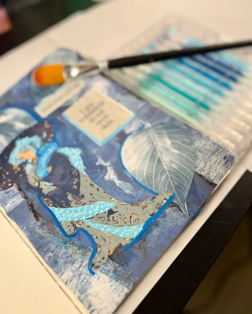
• Paint your mood, What does your heart feel today? Choose one color that matches that emotion. Using only one color try to explore its lightest and darkest forms. Let the variations in value tell your story.
• Choose a color that reminds you of childhood and build a page around that memory.
• Make a monochrome collage using paper scraps of the same color but different shades. For example if you decided to use red use all shades of red.
Common Mistake
Everything looks flat and uninteresting.
✔ Fix
Use the full value range: Create dynamic contrast! use the full spectrum within your color. For example use transparent washes to opaque, near-white highlights and deep, shadowy shades.
very pale → mid-tone → very deep.
Think watercolor washes + bold acrylic accents.
Peaceful Neighbors (Analogous Colors)
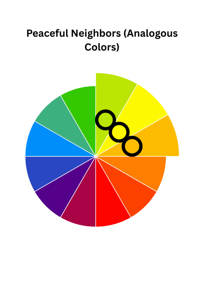
What it is: Colors sitting next to each other on the wheel. For example, blue, blue-green, green.These combinations are serene and easy on the eyes.
💡 Famous Artwork Examples
• Claude Monet’s Water Lilies—soft transitions of greens, violets, blues.
Look at Claude Monet’s Water Lilies. He wasn’t using every color under the sun; he built his peaceful scenes with harmonious layers of greens, blues, and soft violets that melt into one another.
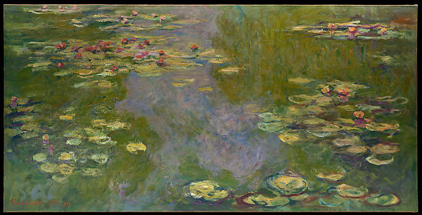
· Source: The Metropolitan Museum of Art
· Link: https://www.metmuseum.org/art/collection/search/438008
🧠 Art Journal Prompts
• Create a “peace” page using 3 neighbors. Use three neighboring colors to build a landscape of your mind, focusing on soft, flowing transitions without any harsh edges.
• Paint a landscape of your feelings using only colors that sit next to each other.
• Make soft, blended backgrounds with a sponge for dreamy transitions.
⚠️ Mistake
Colors blend into one muddy patch.
✔ Fix
Use value contrast: For Example, Make one neighbor MUCH lighter or MUCH darker for clarity.
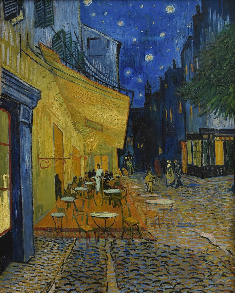
Opposites That Pop (Complementary)What it is:
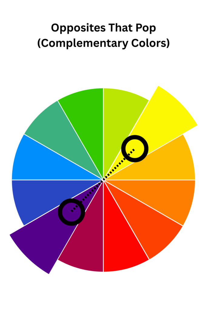
What it is: A high-contrast using two colors directly opposite each other on the color wheel, like red/green or blue/orange. This creates vibrant, energetic art that demands attention.
💡 Famous Artwork Examples
• Van Gogh’s The Café Terrace at Night: Vincent van Gogh was a master of this. In The Café Terrace at Night, the electric blues of the night sky vibrate against the warm, glowing oranges of the café, creating a scene full of life.
https://www.vangoghmuseum.nl/en/art-and-stories/art/vincent-van-gogh
Art Journal Prompts
• Explore two emotions Where is the tension or balance in your life? Paint two opposing forces (like joy/sadness or chaos/calm) using a pair of complementary colors. Watch how they interact and find a balance on the page.
• Make an abstract background and let the opposite color become your focal point.
• Create a collage with warm vs cool contrast.
⚠️ Mistake
Mistake: Using both colors at full, equal strength can feel visually loud or aggressive.
· ✔ Fix
Use the 70/30 rule:
Let one color dominate, let the opposite color be the accent.
Gentle Opposites (Split-Complementary)
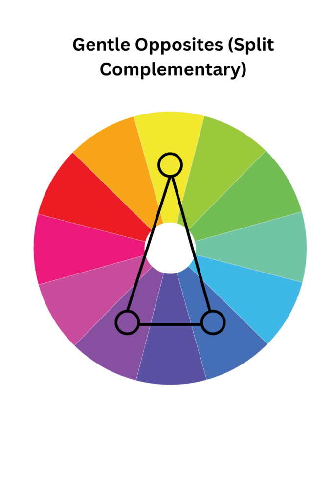
What it is: A more nuanced version of the complementary scheme. You start with one main color, and instead of using its direct opposite, you use the two colors next to its opposite. For example, red with lime-green and turquoise. It offers contrast without the tension.
💡 Master Artist Example: Mary Cassatt often used gentle trios like pinks, yellows, and blue- greens in her intimate portraits of mothers and children, creating a sense of warmth and tender connection.
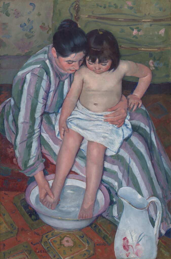
https://marycassatt.org/the-complete-works_pageno-2.html
Mindful Art Journal Prompt: Paint about harmony in diversity. How can two very different parts of you coexist beautifully? Use a split-complementary scheme to show how different elements can support and enhance one another.
⚠️ Common Mistake & Quick Fix:
· Mistake: The three colors can feel scattered and unbalanced if they all have equal weight.
· Fix: Anchor your page by clearly establishing one color as the dominant hue, using the other two for support and detail.
5. The Magic Trio (Triadic)
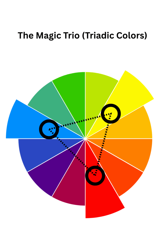
What it is: Using three colors that are evenly spaced around the color wheel, forming a perfect triangle. The primary colors (red, yellow, blue) are the most famous example. This scheme is inherently cheerful and vibrant.
💡 Master Artist Example: Henri Matisse’s The Red Room (Harmony in Red) is a celebration of this. While red dominates, the bold use of yellow and blue in the patterns creates a dynamic and joyful energy.
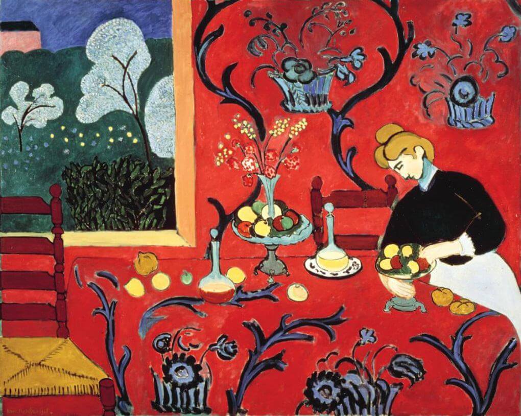
https://www.henrimatisse.org/the-dessert-harmony-in-red.jsp
Mindful Art Journal Prompt: What does pure joy look like to you? Choose three bright, happy colors and fill your page with playful marks, patterns, and shapes. Don’t overthink it—let the color energy guide your hand.
⚠️ Common Mistake & Quick Fix:
· Mistake: It can easily become chaotic and overwhelming.
· Fix: Choose one color to dominate the composition. Use the second color in moderate amounts and the third as a minimal, strategic accent.
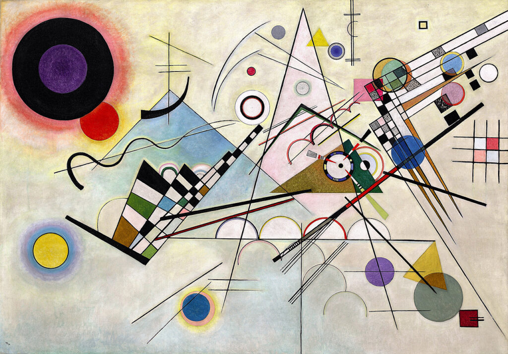
6. The Fantastic Four (Tetradic)
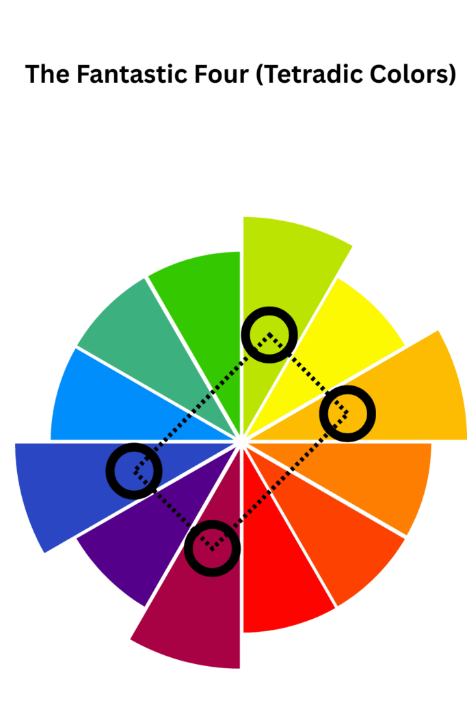
What it is: A rich and complex color combination using two pairs of complementary colors (a rectangle on the color wheel), for example: blue/orange and red/green. It feels full, lively, and symphonic.
💡 Master Artist Example: Wassily Kandinsky, a pioneer of abstract art, used complex color relationships to make his compositions feel like they were vibrating with musical energy.
Mindful Art Journal Prompt: Explore the concept of “contrast” in your life. Represent different dualities (like busyness/rest, public self/private self) using two sets of opposite colors. Layer them and see how they interact to create a complex whole.
⚠️ Common Mistake & Quick Fix:
· Mistake: Four strong colors can compete and create visual chaos.
· Fix: Let one hue be the undeniable leader. Tone down the saturation or value of the other three, or use them in smaller areas to create a balanced, not busy, effect.
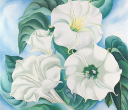
7. Calm Meets Color (Neutral + Accent)
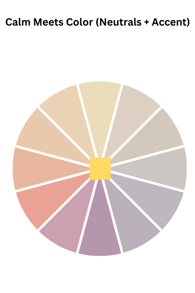
What it is: Combining soft, quiet neutrals (beige, gray, off-white, taupe) with a single bold, saturated color. The neutrals provide a restful space for the accent color to truly sing.
💡 Master Artist Example: Georgia O’Keeffe’s flower paintings often feature a delicate, softly colored bloom against a neutral, abstract background, making the flower’s color feel luminous and sacred.
Mindful Art Journal Prompt: What is your “spark” right now? Paint a background of quiet, calming neutrals. Then, introduce one bold color that represents your current inspiration, hope, or energy.
⚠️ Common Mistake & Quick Fix:
· Mistake: The page can feel dull if the neutrals are too uniform and the accent color is too timid.
· Fix: Add texture and variation to your neutrals. Then, be brave with your accent color—make it bright, deep, and intentional.
8. Soft & Dreamy (Muted Tones)
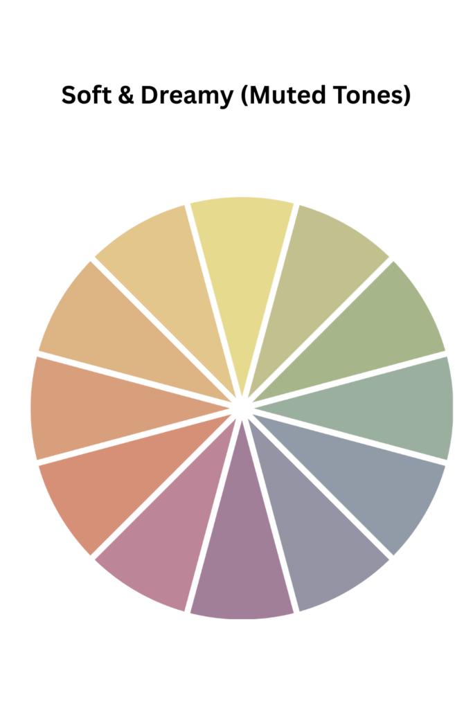
What it is: Using colors that have been grayed down, softened, or desaturated. Think dusty rose, sage green, misty blue, and buttery yellow. This palette is poetic, nostalgic, and deeply peaceful.
💡 Master Artist Example: James McNeill Whistler’s Nocturnes are the perfect example of this color scheme. They are subtle, hazy, and feel like half-remembered dreams or memories fading at the edge of consciousness.
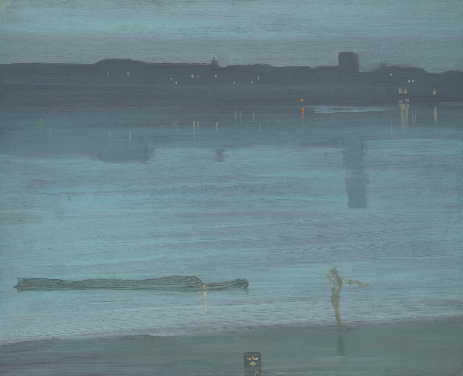
Mindful Art Journal Prompt: Create a “quiet page.” Use muted, softened colors to express a moment of stillness, reflection, or a gentle memory. Focus on the feeling of softness and air.
⚠️ Common Mistake & Quick Fix:
· Mistake: Over-mixing can turn all your colors into a uniform, muddy gray.
· Fix: Mix your muted colors thoughtfully, and leave some areas of purer, fresher color to create breathing room and subtle contrast.
9. Light & Airy (Pastel)
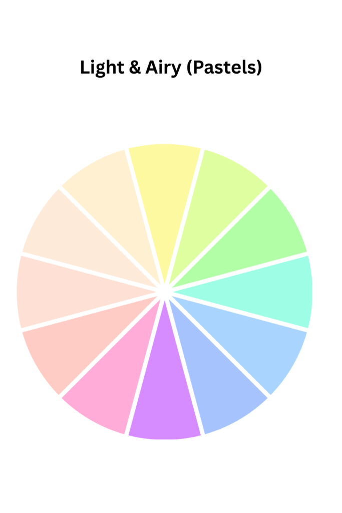
What it is: A palette built from the lightest, brightest tints, the colors you get by adding white to a hue. Soft pinks, lemon yellows, sky blues, and mint greens. It’s optimistic, ethereal, and full of light.
💡 Master Artist Example: Childe Hassam captured the quality of sunlight and domestic joy by bathing his scenes in a glow of soft, luminous pastels and warm creams.
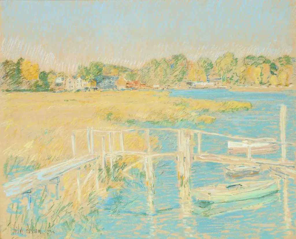
https://commons.wikimedia.org/wiki/File:Hassam_-_Up_the_river,_1906.jpg
Mindful Art Journal Prompt: Paint what “lightness” feels like in your body. Use a palette of airy pastels and let every brushstroke feel like sunlight, a deep breath, or a moment of relief.
⚠️ Common Mistake & Quick Fix:
· Mistake: A page full of pale colors can feel ungrounded and floaty without an anchor.
· Fix: Introduce one slightly darker, more saturated color (a navy blue, a deep mauve) to ground the composition and provide a point of focus.
10. Follow Your Heart (Intuitive Color)
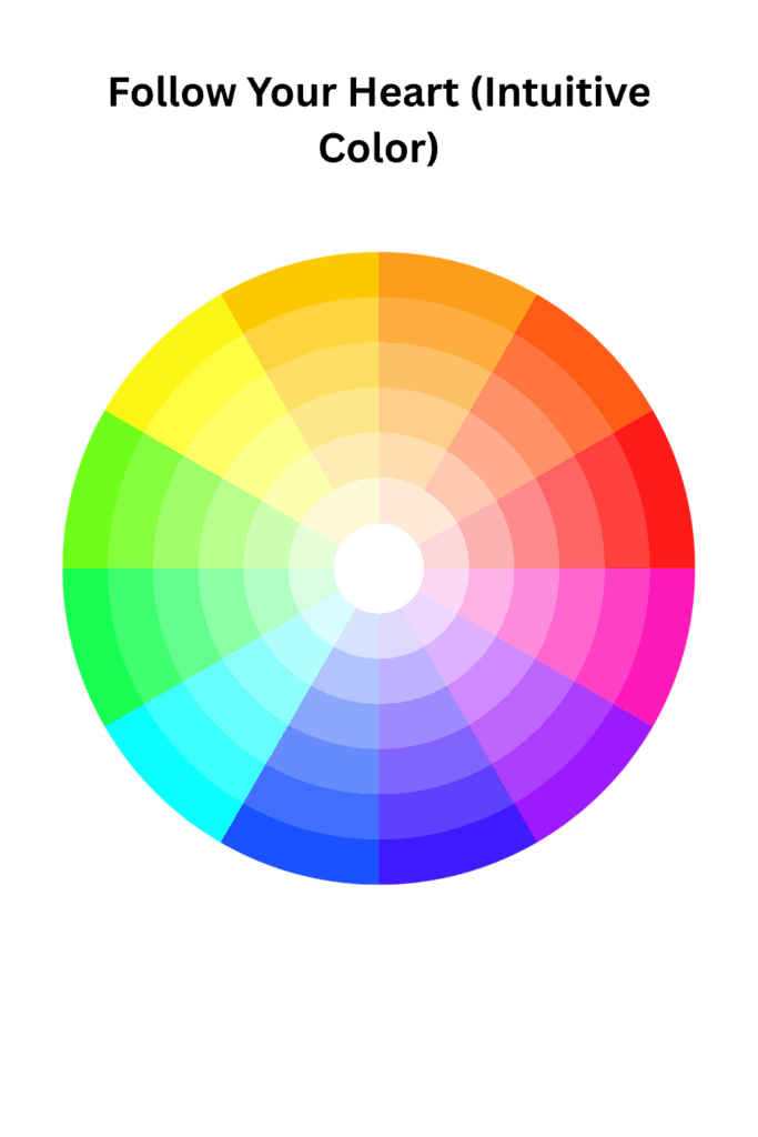
What it is: Throwing the rulebook out the window. This is about trusting your gut and choosing colors based purely on emotion, memory, or what simply brings you joy in the moment.
💡 Master Artist Example: Frida Kahlo is the ultimate inspiration here. Her use of color was fearless, personal, and symbolic, drawn directly from her Mexican heritage and her own intense emotional life.
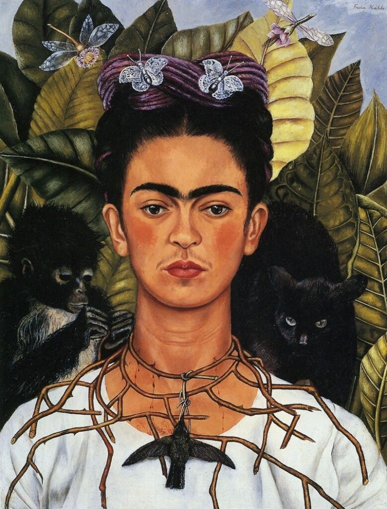
Mindful Art Journal Prompt: Close your eyes. What do you feel? Now, open them and choose your colors without thinking. Paint from that emotion, not from logic. Let the colors lead you where they want to go.
⚠️ Common Mistake & Quick Fix:
· Mistake: Overthinking, self-judgment, and trying to force a “pretty” outcome.
· Fix: Remember, there are no mistakes in intuitive art. If you don’t like something, see it as a layer of discovery, not a failure. Keep going. The most authentic art lives here.
I found this video very helpful to understand color. Although it is for film making the video defiantly applies to art journaling.
https://www.studiobinder.com/blog/what-is-a-color-scheme-definition
Top 5 Common Color Mistakes in Art Journaling (and How to Fix Them)
1. The Muddy Mix: Your beautiful colors turn into a brownish-gray sludge.
· The Fix: This often happens when you mix two complementary colors together too thoroughly. Mix more deliberately, clean your brush between colors, and let layers dry before glazing over them.
2. Color Overload: Too many bright, saturated colors competing for attention.
· The Fix: Embrace the power of neutrals! Add white, gray, black, or beige to create breathing space. Remember, a few vibrant pops against a quiet background are more powerful than a full-page shout.
3. The Flat Page: Your art lacks depth and dimension.
· The Fix: You’re not using a full range of values. Push your darks darker and your lights lighter. Even in a monochromatic scheme, contrast in value is what creates form.
4. No Focal Point: The viewer’s eye doesn’t know where to look.
· The Fix: Establish a color hierarchy. Choose a “hero” color to be the main event, a “supporting” color for secondary areas, and a tiny “accent” color for sparkle and focus.
5. Fear of Experimenting: Sticking to the same “safe” colors every time.
· The Fix: Give yourself permission to play by dedicating a journal page to “color experiments.” Make messy swatches, try ugly combinations, and see what happens. Curiosity will always teach you more than perfectionism.
Your Color Scheme Questions, Answered (FAQ)
Q: How do I choose a color palette when I feel completely stuck?
A: Don’t start with the color wheel; start with a feeling. Ask yourself: “What emotion do I want to capture?” (e.g., calm, joy, mystery). Then, look at the world for example a photograph, a piece of fabric, a sunset and then steal a palette from nature. Your mood is the best compass. The color wheel is there when in need.
Q: My colors always end up looking muddy. What am I doing wrong?
A: This is the #1 question! Mud is usually caused by over-mixing or using too many colors at once (especially opposites). Try using a limited palette of 3 colors plus black and white, mix on a clean surface, and rinse your brush thoroughly between colors.
Q: Do I need to buy expensive artist-grade paints to get beautiful colors?
A: Absolutely not. While artist-grade paints have more pigment, you can create stunning work with student-grade supplies. It’s more about understanding color relationships and value than the price tag. Learn with what you have, and upgrade as you grow.
Q: How can I make my art journal pages feel more balanced?
A: Use the 60-30-10 rule as a starting guide. Let one color cover about 60% of the page, a second color cover 30%, and a third accent color make up the final 10%. This creates a natural, pleasing balance.
Q: Is it okay to break the color theory rules?
A: Always. The rules are not cages; they are training wheels. They give you confidence and a starting point. The most powerful, personal art you will ever make begins the moment you listen to your own intuition over any rule.
Disclaimer: Some links in this post may be affiliate links. This means that if you purchase something through that link, I get a small commission, at no extra cost to you.
Your Color Journey Starts Now
Remember, color is not a test to be passed. It’s a conversation between you and your heart. It’s emotion, memory, and intuition all wrapped up in paint and paper.
You don’t need to be “good” at color; you just need to be present with it. Notice how certain blues make you feel calm, how a burst of yellow can lift your mood. That awareness is your greatest tool.
So, open your journal. Pick up a brush. Mix something unexpected. Paint your mood in all its complex, beautiful shades.
Your unique color voice is waiting to be heard. Let it sing.
What color combination are you excited to try first? Share your creations and tag me on social media [@artfulhaven]
I can’t wait to see what you make!
Salwa