beyond the flat: a guide to creating captivating depth in your art
Depth in art is the illusion of three-dimensional space on a flat surface. You can create it using 8 simple techniques: overlapping objects, varying size, placement on the page, color temperature, value contrast, light and shadow, level of detail, and linear perspective. Beginners can start with just overlapping and size — no advanced skills required.
Creating depth transforms simple sketches into magical scenes. Whether you’re working with watercolors, acrylics, or just pens and markers, understanding depth will take your art journaling to the next level.
The best part? You don’t need advanced skills to start creating depth today.
Estimated reading time: 14 minutes
I’ve always believed that art is a language. This language is full of tricks and once you learn its alphabet and tricks, everything becomes easier and more enjoyable.
Let’s break down the techniques that famous artists have used for centuries. I will simplify it so even a complete beginner will find it easy to follow.
Don’t Forget to grab your free depth art prompt at the end of the page.
Key Takeaways
- Creating depth enhances your art journaling by providing a three-dimensional feel on flat surfaces.
- You can use techniques like overlapping, size variation, and color temperature to create the illusion of depth.
- Start with simple methods, such as placing larger objects in the foreground and layering for visual interest.
- Observe how famous artists used these principles in their works, allowing you to learn and apply similar techniques.
- Practice through prompts and exercises to gradually build your skills in creating depth.
Table of contents
- What is Depth in Art (and why Should you care?)
- Simple Techniques to create depth in your art journal
- overlapping: The easiest depth trick ever
- Size Matters: Make Things Smaller as They Go Back
- Placement on the Page: Higher = Farther
- Color Temperature: Warm Forward, Cool Back
- Dark vs. Light Creates Distance
- Observing the Light and shadow
- Detail: More Detail = Closer
- Linear Perspective: The Classic Depth Creator
- Art Journal Prompts to Practice Depth
- FAQ
- Common Depth Mistakes (And How to Fix Them)
- How to Add Depth in Art Journaling
- Final Thoughts: Start Simple, Build Confidence
- What’s next?
What is Depth in Art (and why Should you care?)
Depth is the illusion of 3D space on a flat surface. It’s what makes some objects seem closer while others far away. when you master depth, you can easily add it to your art journals for more interest and creativity. The good news you don’t need fancy supplies or years of training. just a few simple trick!
Simple Techniques to create depth in your art journal
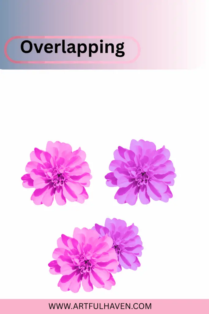
overlapping: The easiest depth trick ever
When one object sits in front of another, your brain instantly knows which is closer. For example, when two trees overlap you know which one is closer to you and which one is further away.
Simply draw one shape overlapping another….That’s it! you just created depth!
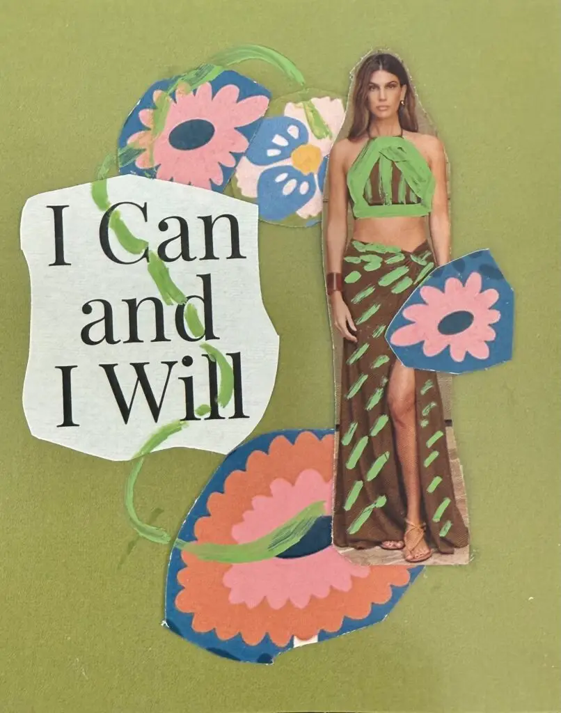
Artist Example: Henri Matisse used overlapping shapes brilliantly in his cut-out college, creating layers of depth with simple paper shapes.
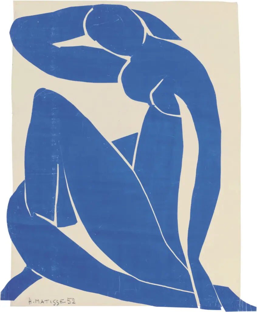
Notice here how Matisse used simple overlapping to show that the hand is in front of the leg and so on…
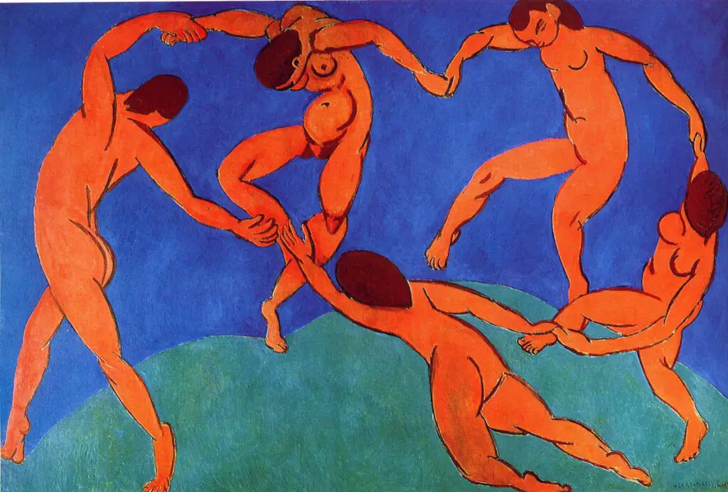
Again here Matisse created depth by simply overlapping. Now we know which figure is in the front and which one is at the back.
Try This: In your art Journal, draw or paste three flowers where each one slightly covers the one behind it. Instant depth!
or
Layer collage papers or doodles on top of each other. Overlap adds a rich, visual texture that mimics real depth.
Size Matters: Make Things Smaller as They Go Back
Objects that are closer appear larger, while those farther away appear smaller. Draw your foreground elements larger and gradually make things smaller as they recede.
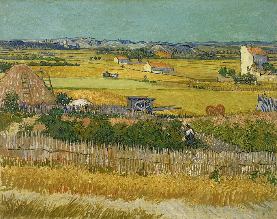
Famous Artist Example: Vincent van Gogh’s “The Harvest” shows distant fields getting little by little smaller, pulling your eye deep into the landscape.
Try This: Draw a path or river that starts wide at the bottom of your page and narrows as it moves upward.
or
Paint flowers, make the ones in front bigger and full of detail. Gradually reduce their size as they move into the background. This is super easy way to create the illusion of distance.
Placement on the Page: Higher = Farther
Another simple but powerful trick:
• Objects lower on your page seem closer.
• Objects higher seem farther away.
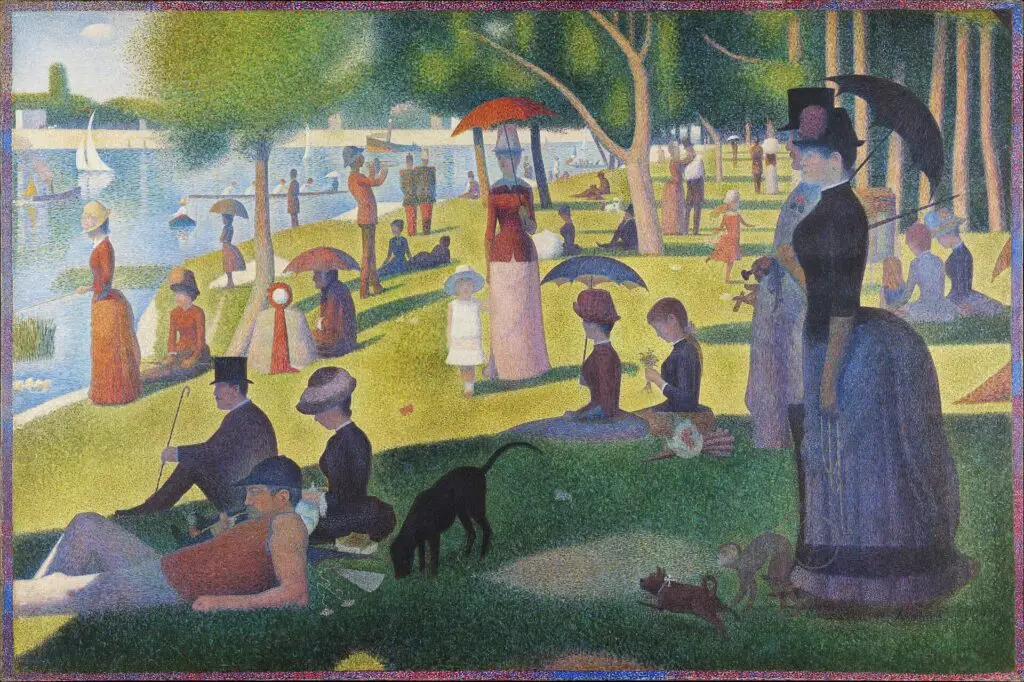
Artist’s Example: George Seurat’s A Sunday on La Grande Jatte (1884-1886) The Large figures sitting and standing along the riverbank are placed lower on the canvas so they feel close to us.While smaller figures are placed higher so they appear farther away in the distance.
Try this:
Draw or collage two figures one big and low on the page and the other small and high. Let placement create the story
or
When creating a landscape spread, put your horizon line in the upper third of the page for maximum depth.
Color Temperature: Warm Forward, Cool Back
Color can tell the viewer where to look.
• Use warm, saturated colors (reds, oranges, yellows) in the foreground.
• Use cool, desaturated colors (blues, grays, purples) in the background.
You want to learn more about color check this in-depth but easy to understand color Theory blog.
Basic Color Theory For Artists: Make Stunning Art Every Time
So the next time you step outside, I encourage you to observe the nature around you. Notice how the trees close to you look darker green and full of details while the trees far away are lighter and have less details.
Another example is mountains in the distance, look how they fade into blue tones because of the atmosphere. That’s called atmospheric perspective, and you can use it even in whimsical or abstract art.
Famous Artist Example: Paul Cézanne used warm and cool colors to create depth in his still life paintings.
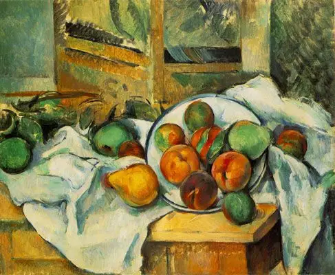
Look how the orange and yellow feel more near and your eye goes directly to it.
Art Journal Tip: Use warm-toned markers or paints for your main subject and cooler
tones for the background.
Dark vs. Light Creates Distance
Objects closer to you have stronger contrast and darker values. Things farther away become lighter and hazier. This is also an atmospheric perspective property.
Artist’s Example: Edgar Payne created depth by making the trees darker in the foreground and the mountains in the back lighter.
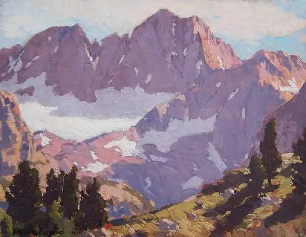
Beginner-Friendly Method: Use more water in your watercolors for background
elements, making them lighter and softer.
Observing the Light and shadow
Light and shadow are the heartbeat of depth. this is one of the most used techniques to create 3D.
When you use contrasting values such as strong highlights and dark shadows, you will be able to sculpt your subject and make it pop.
The smoother your transitions, the more realistic and three-dimensional your art will feel. Remember light creates highlights, shadow created depth and blending creates realism.
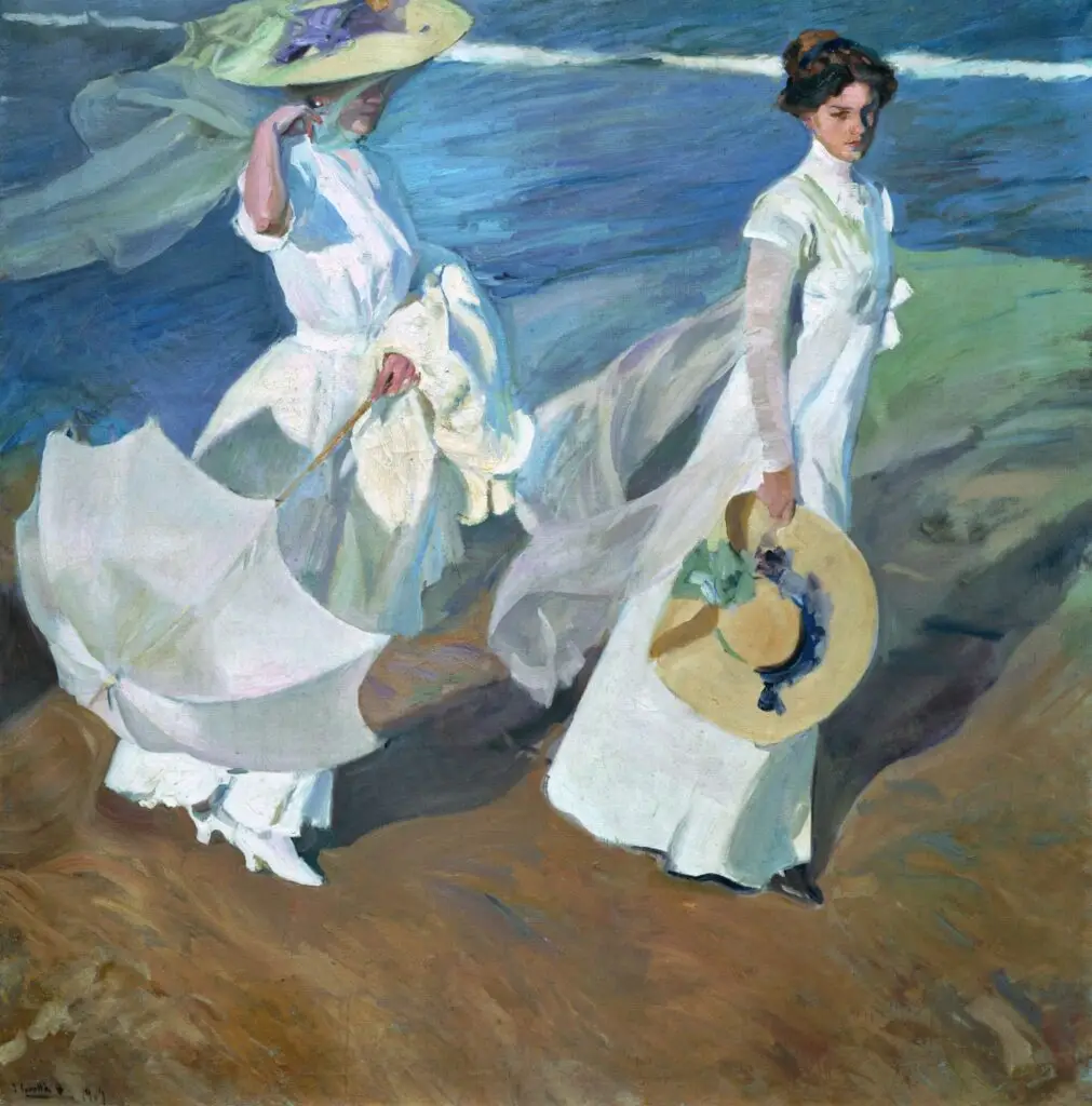
Artist’s Example: Sorolla’s work Strolling by the Sea side is a great example of how he utilizes light and shadow to show depth and 3D to the figures.
Try this: Draw a simple sphere. Shade one side darker, leave the opposite side light, and softly blend between them. Boom instant 3D!
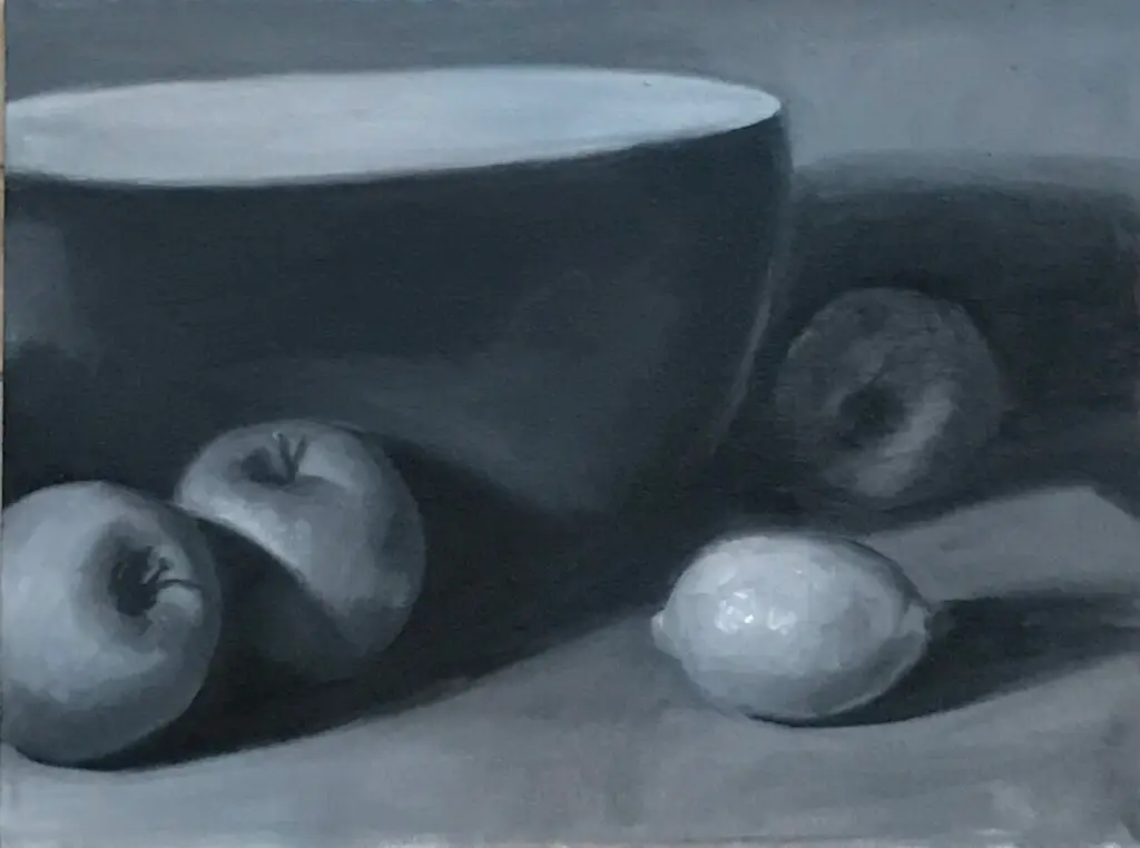
Detail: More Detail = Closer
Objects that are closer to us appear sharper and more detailed.
Objects that are farther away have less detail, softer shapes, and fewer textures.
So when you’re drawing or painting:
• Add crisp details, clear lines, and textures to things in the foreground
• Keep shapes in the background softer, lighter, and simpler
Artist’s Example: in Sargent’s Mountain stream you can feel the depth of the painting.
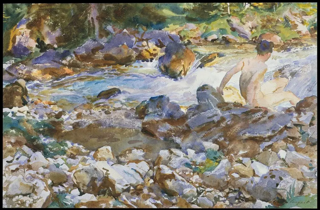
Notice how Sargent brilliantly used the trick of depth. For example he used more details in bottom of the page and less details almost blurred background up the canvas.
Try This: In the background, paint simple shapes of flowers with fewer details. Near the bottom of your page draw a flower and really focus on its petals try to add the veins, tiny edges, and little imperfections.
Instant depth — no shading needed.
Linear Perspective: The Classic Depth Creator
This means that lines look like they meet as they go farther away.
For example railroad tracks, they start wide near you and get closer together until they almost touch in the distance.
Famous Artist Example: Wayne Thiebaud’s, Flat River, 1997
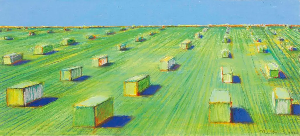
The lines get closer together as they move away from you.
Even though Thiebaud mixes viewpoints (sometimes you feel like you’re looking from above), the painting clearly shows how all the landscape lines guide your eyes toward one point in the distance.
Try This (super easy):
Draw a road or path using two straight lines:
• Make the lines far apart at the bottom of the page → this feels close.
• Make the lines closer together as they move up the page → this feels far away.
You just created depth!
Art Journal Prompts to Practice Depth
Ready to practice? Now that you learned these tricks lets try to apply them in your art journal:
1. Forest Path: Draw a winding path through trees, using size, placement, and
overlapping to create depth
2. Flower Garden: Create a garden scene with large flowers in front and smaller
ones behind
3. Mountain Landscape: Use three layers such as dark foreground hills, medium-value middle mountains, and light distant peaks
4. City Street: Draw buildings getting smaller as they recede, with a simple
one-point perspective
5. Underwater Scene: Layer fish and plants with overlapping, making distant
elements lighter and bluer
6- Try shading one simple object using a pencil (like a ball or apple from light to dark to practice volume.
7- Create an art journal page with layered papers, transparent paint, and shadows.
FAQ
Depth in art is the illusion of three-dimensional space on a flat, two-dimensional surface. Artists create depth using techniques like overlapping, size variation, color temperature, value contrast, and linear perspective.
Overlapping is the easiest depth technique. When you draw one shape in front of another so it partially covers it, your brain instantly understands which object is closer. You can use this with any subject such as flowers, trees, figures and above all, no shading required.
Atmospheric perspective is the way objects appear lighter, hazier, and cooler in color as they recede into the distance. Mountains far away look pale blue because the atmosphere itself scatters light. You can mimic this in your art by softening colors and lowering contrast in the background.
The most common reasons are: every object is the same size, every part of the page has the same level of detail, and the foreground and background use the same colors and values. Vary at least one of these and depth will appear immediately.
In an art journal, depth comes from layering as much as drawing. Use collage layers (paper, fabric, photos), transparent paint washes, stamping or stenciling in the background, and shadows under cutouts. Each layer creates literal physical depth in addition to visual depth.
Common Depth Mistakes (And How to Fix Them)
Mistake #1: Everything is the same size
Fix: Vary your sizes dramatically for example make foreground objects 2-3x larger
Mistake #2: Using the same level of detail everywhere
Fix: Add texture and details only to your focal point and foreground
Mistake #3: Flat, even colors throughout
Fix: Lighten and cool down your background colors warmer colors in the foreground.
How to Add Depth in Art Journaling

In your art journal, depth doesn’t just come from drawing, it comes from layering.
Try:
1- Collage layers (paper, fabric, photos).
2-Transparent paint washes.
3-Stamping or stenciling in the background.
4-Shadows under cutouts or doodles.
Each layer tells a story and invites the viewer to look closer — that’s emotional depth as much as visual depth.
Final Thoughts: Start Simple, Build Confidence
Creating depth doesn’t mean your art journal needs to look like a
masterpiece. Start with one or two techniques. Let’s begin maybe with overlapping and size then gradually add more as you gain confidence.
Creating depth in art is about more than technique. It’s about connection.
You’re inviting your viewer to step into your world, to feel your story.
The more you experiment with shading, color, and perspective, the more life your art will have.
Remember: Every artist started exactly where you are now. Van Gogh, Matisse, and Cézanne all learned these same principles. The difference? They practiced,
experimented, and didn’t let perfectionism stop them.
So grab your brushes or journal, and start layering your magic.
Your art journal is your safe space to play, make mistakes, and discover what works for you.
What’s next?
You don’t need to master everything at once. Depth comes together the same way art does, layer by layer, one small decision at a time.
To make everything easier,
I created a free Depth Cheat Sheet that breaks down all the techniques from this blog into simple visual steps you can keep beside you while you create.
And because learning is always more fun with inspiration, you’ll also get a set of free depth-themed art prompts you can use whenever you’re stuck or want a new idea.
Keep exploring.
Keep layering.
Grab your art supplies and try one of the prompts above. start with the easiest technique such as overlapping and watch your pages transform.
Keep Creating
Salwa
Artful Haven