Easy collage Idea for Your Art Journal (step-by-step)
One of the easiest and most fun ways to bring life to your art journal pages is through collage. It’s simple, relaxing, and always full of surprises. In this tutorial, I’ll show you step by step how I created a bold art journal collage using colored paper, glue, magazine cut-outs, and a black-and-white flower illustration.
The best part? You don’t need expensive art supplies—just scissors, glue, and some paper scraps you already have at home. This makes it a perfect beginner-friendly collage idea that you can try anytime.
Along the way, I’ll be throwing in some artsy words and a few tips and tricks. Take what inspires you and leave what doesn’t. It’s all about making the process your own. We’re here to enjoy, play, and let our creativity flow freely.
To create this fun and easy art journal collage, here’s what you’ll need:
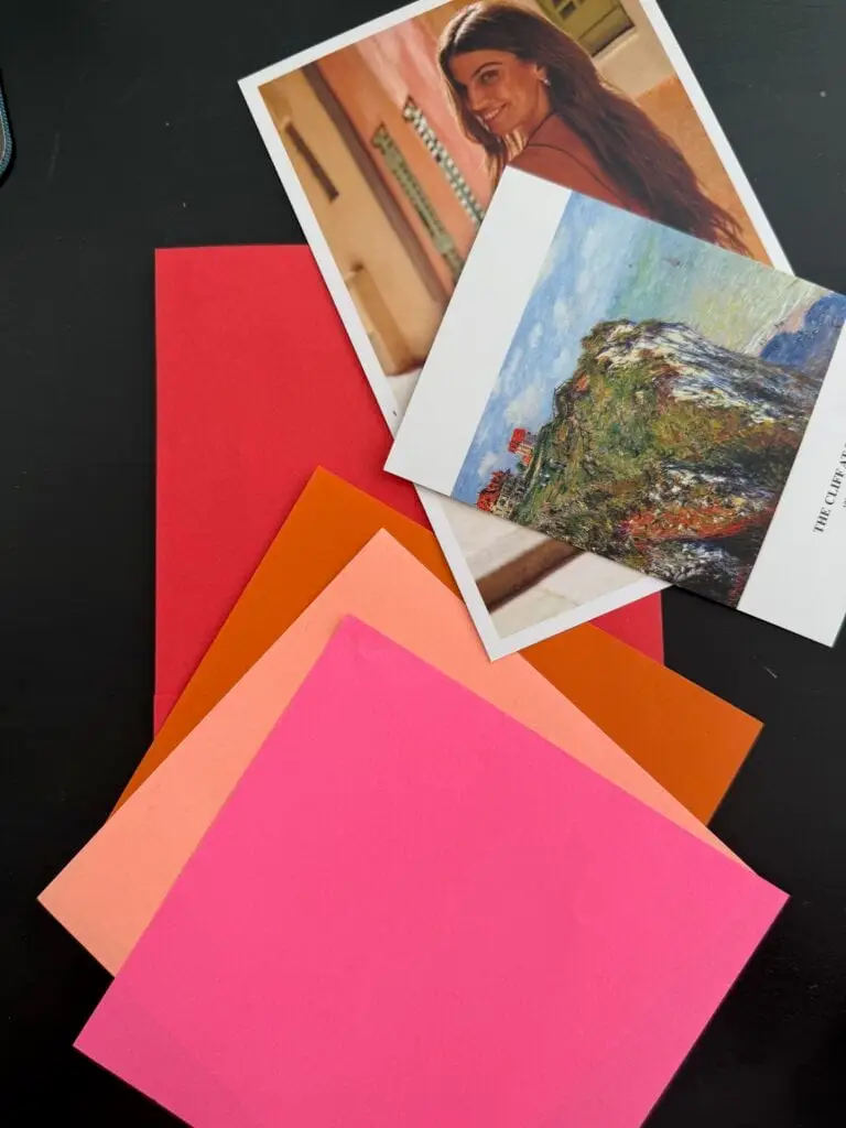
Red, orange, pink, and peach paper (any scraps will do!)
A magazine cut-out of a model
A black-and-white flower illustration (printed or clipped from a magazine)
Glue stick or any glue you like
Scissors
Your art journal (or just a sturdy page to work on)
Optional extras: paint, markers, or pens for adding your own little details
Step 1: Build Your Red Background
For this collage, I suggest choosing one dominant color and then adding papers in similar color temperatures. For example, if you pick red (a warm color), you can combine it with shades like orange, red-orange, and peach. Sticking to one color family helps your collage feel harmonious and balanced.
I started with a red sheet of paper as my base, making red my main theme color. It instantly gave the whole collage a bold, powerful energy and tied all the pieces together.
Quick Tip:   Warm vs Cool Colors
When choosing your collage colors, think about color temperature:
• Warm colors → red, orange, yellow, peach. These feel energetic, bold, and fiery.
• Cool colors → blue, green, purple. These feel calm, cold, and soothing. If you pick one main color (like I chose red), try adding papers from the same temperature family. This makes your collage composition feel unified and balanced.
For variety, I added one green paper with plant texture to balance the warm colors.
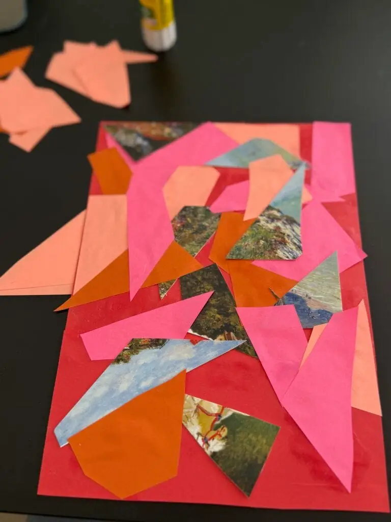
Step 2: Add Geometric Paper Shapes
First, I cut triangles and angular shapes from pink, peach, and orange paper. Next, I carefully glued them down, making sure to leave small gaps between each piece so the red background could peek through. As a result, this simple layering technique added texture and depth while also keeping the page feeling light and dynamic instead of completely covered.
After that, to create contrast, I added a few pieces of paper with cool, natural textures, like bits of sky and trees. Finally, these cooler tones balanced the warmth of the main colors and made the entire collage look more harmonious and interesting.
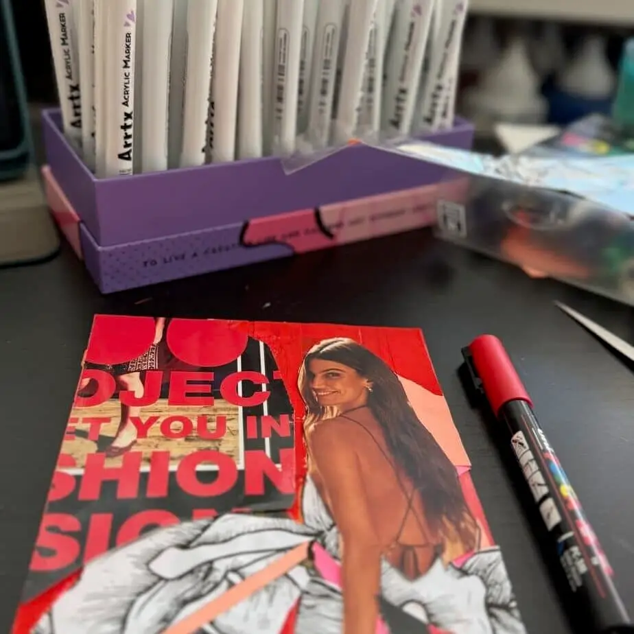
Step 3: Place the Focal Point (the Model)
Next, I cut out a model from a magazine and glued her slightly off-center. To make her stand out, I arranged the background shapes so their lines naturally led the eye toward her.
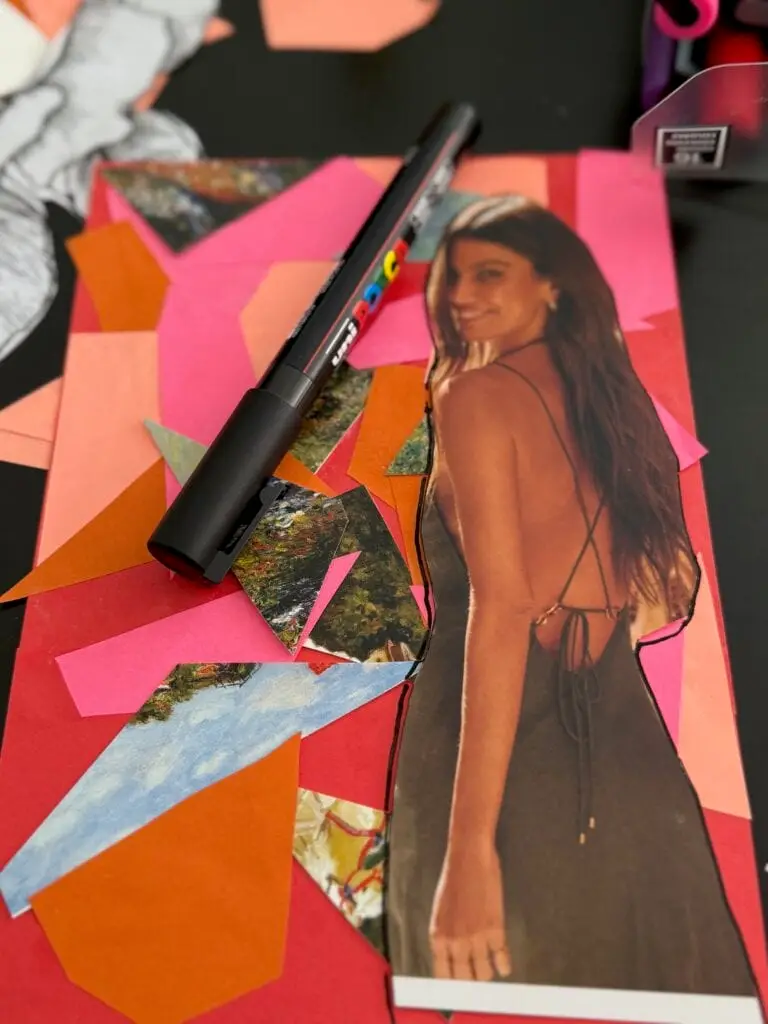
Step 4: Outline the Model’s Shape
I placed the model where I wanted her on the page and used a black marker to outline her figure. This small detail made her pop off the page—almost as if she were drawn into the collage—and gave the composition a bold, graphic finish.
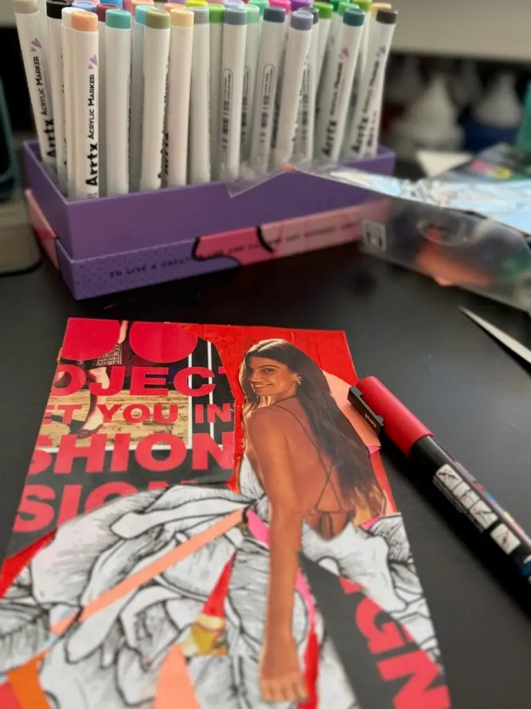
Step 5: Cut Out the Clothes for a Background Dress
Here’s my favorite part: instead of keeping the clothes, I carefully cut them away so the background showed through as her dress. I usually love this fun technique because it ties the whole page together and makes the background feel like part of her outfit. But in this collage, I didn’t like the result—so I changed direction.
And that’s totally okay! collage is all about experimenting! Sometimes a technique works beautifully, and sometimes it doesn’t. The fun is in trying new things, seeing what happens, and letting your creativity lead the way.
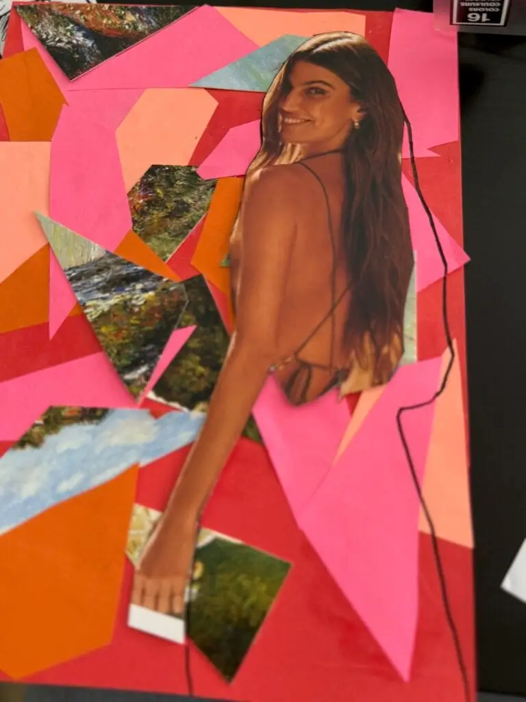
Step 6: Add Black & White Flower Illustration
I decided to try something different that I hadn’t planned for, so I took pieces of a large black-and-white flower drawing and glued them around the model’s dress area. The organic, flowing lines of the flower softened the sharp edges of the geometric background. I made sure to place the flowers so they didn’t cover the background completely, letting some of it show through. I also positioned the flower shapes so their lines and angles led the eye directly toward the model.
This is a simple but effective trick in collage composition—using background pieces to guide the viewer’s gaze to your focal point.
Tip
When building a collage, use the lines and shapes in your background to guide the viewer’s eye toward your focal point. It’s a simple trick that makes your composition feel more intentional and dynamic.
Step 7: Blend and add the Final Touches
Some areas felt too busy, so I painted over them with red to unify the background. I also outlined certain cut-outs in black, which made the shapes stand out more and gave the collage a polished, finished look.
Don’t be afraid to adjust as you go sometimes the little changes are what make your collage truly come alive!
Creating this collage was such a fun and freeing process, and I hope it inspires you to play with color, shapes, and textures in your own art journal.
Remember
There’s no right or wrong, just creativity waiting to unfold.
I’d love to see what you come up with! Share your pages with me on Instagram or Facebook and tag me so I can celebrate your creativity with you. Let’s keep inspiring each other!
If you want to learn more about fixing mistakes here is an older post